COVERS
ISSUES 01, 02 & 03
Chromatic Issue 03: Westminster University, London UK
Chromatic Issue 02: Leeds Art University, Leeds, UK
Chromatic Issue 01: Central Saint Martins, London, UK
Chromatic’s covers have been partly constructed by the information provided in Eye Magazines, ‘Anatomy of a Magazine’.
Chapter one’s author’s Ian Birch and Jason Ford explain that “Great magazine covers are built on a sense of fearlessness” which can be achieved through a variety of conventions with particular approaches.
One of the first elements “a good cover contains” is “distilling the title’s voice, look and purpose” (Birch and Ford, 2018). The name of the magazine derives from the dictionary meaning “Chromatic is a pure colour that contains no hints of white, black, or grey”. We all know fashion breaks ‘rules’ and defies expectations, which is exactly what the masthead does in relation to its meaning. The masthead has been created to use a chrome effect within its hand-made lettering, which juxtaposes its meaning by including white, black and grey. This design choice has been made to provide the target audience with a sense of expectation of what the magazine entails, an expressive, non con-formative approach to the standard fashion magazine. Chromatic focuses on upcoming, recently graduated designers, who do not commonly have featuring access to a fashion print magazine.
The placement and image choice for each cover is selected down to the success of its engagement with the target audience. An influential convention is the colours present in the image which are key in being an eye-catching element. They should be colourful yet fitting with the season of release. It also sets the foreground for what the main colour will be for that issue and will carry throughout the inside of the magazine. Going beyond the colour of the image, it is important for the placement/shot of the model to be considered. An industry-wide rule for covers is the 5/5 rule which can be achieved through the image chosen. Our humanely instinct is to look at an image before any text as “we prefer photography to illustration or pure type because they take more time and effort to decode” (Birch and Ford 2018). Therefore, having a photograph that has strong eye contact is key to engaging with the target audience. Therefore, across
all Chromatic covers, the photograph features a model using strong eye contact.
INSIDE PAGES
Editors Letter and Contents
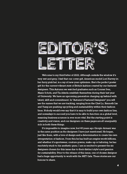
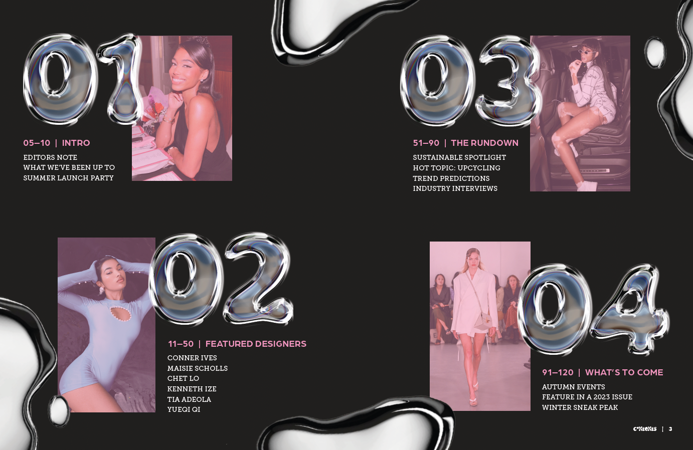
All Issues of Chromatic use repeated conventions which have been adapted to suit each release and their season of debut. Using issue 02 as an example, the orange hue present across the images and elements on the back, spine and front cover, is reflective of the summer season. This design choice expands into the magazine, as seen in issue 03, where the pink has been used on regular featured pages of Chromatic. The contents and listings use the same shade of pink for headings and image overlays to reinforce the issue that the reader is engaging with and further provides a fun justification of owning several or all copies.
Contents
The contents is the first spread that readers are greeted by which sets the tone for the inside of the magazine. Therefore, it uses several conventions and typographic choice from articles and other pages. One of the main elements is the chrome numbering and decorative elements which reinforces the magazines name and maintains its purpose throughout. The layout of this page provides navigational devices though hierarchy of the numbers and headings on how to consume the information. This also the first time that the reader sees the image’s being designed to fit into the themed colour of the issue which reappears in the listing. This has further been done on this type of page to make sure it supports the reader knowing when they’re reading an article or a conventional page.
Editor's Letter
The editors letter has been kept simple but effective by using the chrome effect for the heading in order to notify that the page holds significance without being too expressive and challenging of other pages in the magazine. To further the visual engagement, the body text uses the primary typeface ‘Museo Slab’. A slab serif typeface has been used throughout to provide a sense of balance between the bold graphic styles of the chrome designs and the sleek modern characteristic of the secondary typeface ‘Arboria’. A slab serif was the appropriate choice as the overall tone for Chromatic is that its a modern and unique approach to a fashion based magazine. This would not have been emulated through a serifed font due its traditional features. Another sans serif font would not have been justifiable as pairing two typeface of a similar nature, would not make the correct impact intended. Therefore, this particular Slab Serif was chosen due to range of weights it offered, and its ability to provide great legibility despite its slightly rigid nature. It is also a great fit due its poignant features which are rather expressive and fitting of the aims of Chromatic.
Articles (Featured Designers and Upcycling)
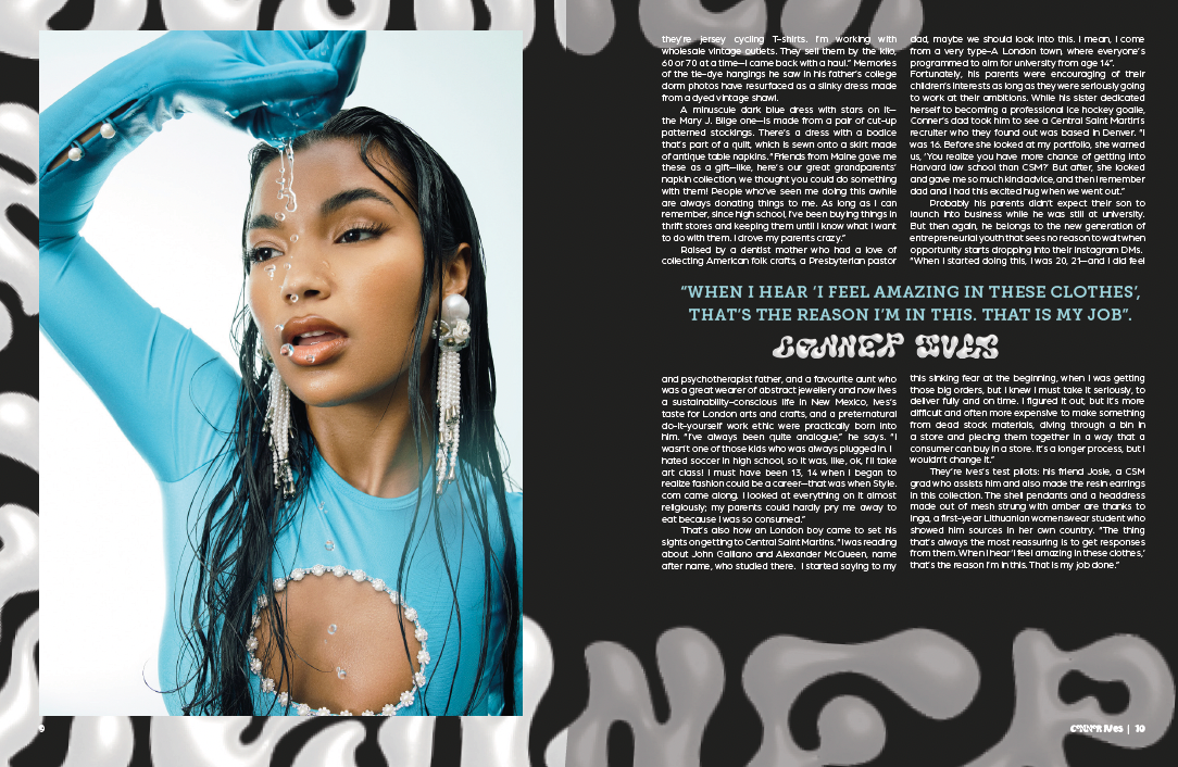
Featured Fashion Designers - Conner Ives
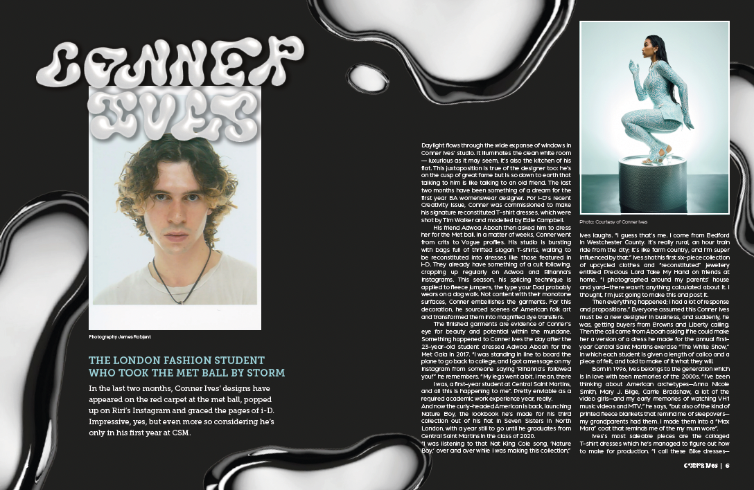
The featured upcoming fashion designer section are the key articles of Chromatic. Therefore, they possess the most elaborate elements including the typography, hierarchy, colours and graphic elements. ‘Conner Ives’ is the first featured designer and sets the tone for the bold typography to be seen throughout these articles. The same approach to masthead, in terms of the hand lettering is seen used for the heading prefacing the designs name, which is a repeated convention. This to highlight the significance of the article and to really focus on remembering this upcoming designers name.
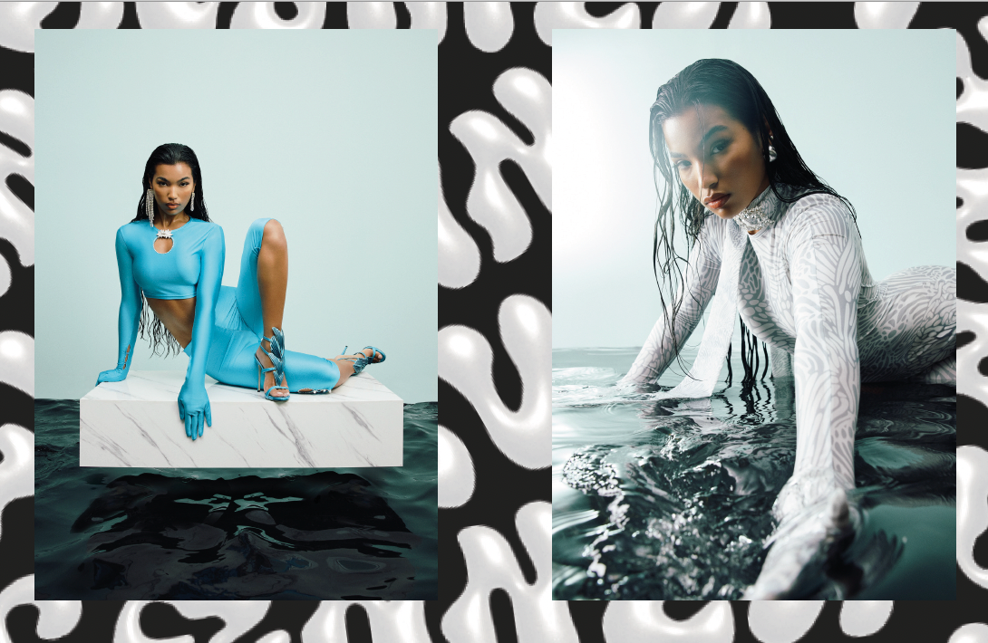
In each of the Featured Designer spreads, they include their own graphic element which relates back to the idea of fashion being individualistic, therefore Chromatic symbolises this through the discussed approach. In the first article, the chrome graphics are used to create an additional area of interest and compliment the nature of the photographs within the article. Across the double page spread, the heading typography has been scaled and transformed to serve as a background for the images again to provide some further visual engaging, that compliments the nature of the photography. This continues on to the last spread of article and helps support the indication of the last page through the fading effect. We also revisit the effectiveness of the Primary font in the blue colour for the pull-out quote which serves as an important line from the article that readers can take something from.
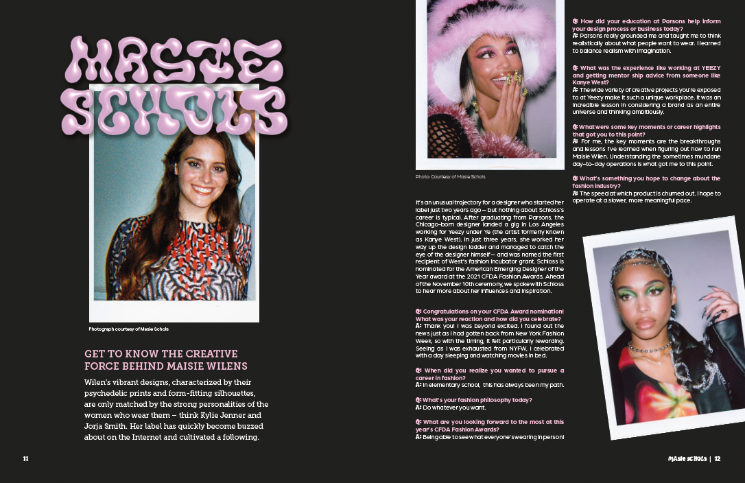
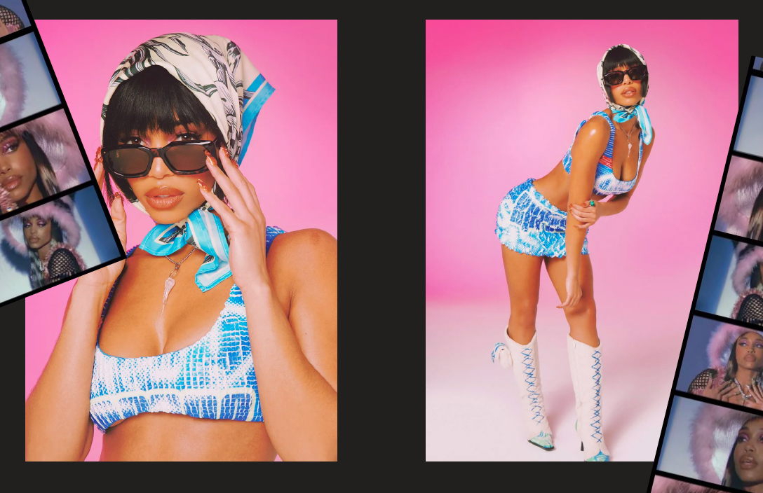
Featured Fashion Designers - Masie Schols
The second article is a visual example of how each featured design article varies through colour and image treatment. Likewise to the first article, the left recto uses the format and benefits from a “orthogonal planning system that parcels information into manageable chunks”. This again, allows the reader to consume the subheading and stand first easier and know what they will be expecting from the text ahead. This article demonstrates the treatment of an interview based spread through new conventions and sign posts.
Each ‘Q’ and ‘A’ signifies the start of a question or answer, which uses the typographic style of the heading. This has been done to include another fun feature that reinforces the effect of making the reader feel “flattered and part of a clever community”. This feature also uses a pink hue which links it to other pink attributes across the page for a cohesive overall look. The treatment of the images in terms of scale and placement varies from the first article, with the first notability being the polaroid effect. This is again a way to emulate the repeated use of polaroids within the fashion industry, capturing apparel and model fittings. The tilted nature comes from the flexibility of the grid and up scaling the excitement of the use of images and placing them in a unconventional or un-expected manner for a magazine.
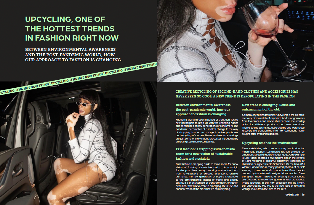
Upcycling Article
The third article represents the treatment of a non-interview/featured designer topic and how the layout has been structured to signify this. The main heading is in Arboria which allows a flow from the largest heading to the subheading in contrasting typefaces, with the subheading remaining in its consistent typeface. Differentiation is also clear through the left alignment and higher placement of the article opening, connoting that the theme of the article varies from what was before. This article still maintains the idea of having a themed colour throughout, used for text and a small yet impacting graphic element.
Listings
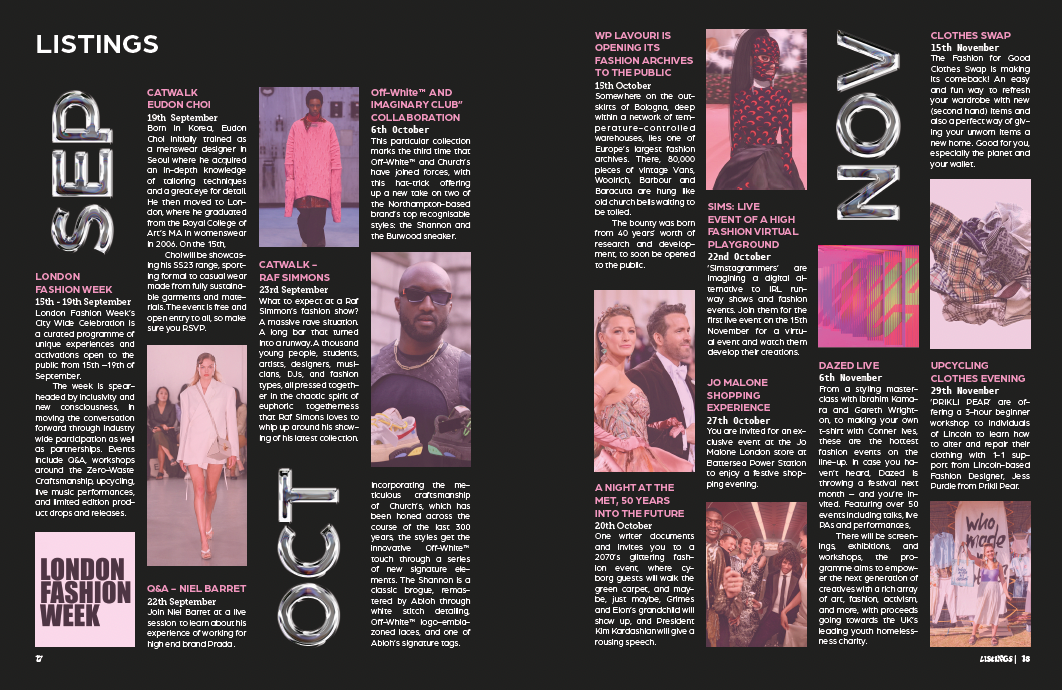
Referring back to the contents and editors letter of Chromatic, these pages have been created to use the themed colour of the issue, which has also been done with the listings page. Not only does it use the pink hue for the headings and images, but it offers a new approach to the grid. Again which benefits the readers experience and expectations across the several areas of Chromatic. The more complex approach to the grid is accommodating of the kind of information and displays how Chromatic approaches the various kinds of articles and information. The format of the grid provides 5mm of gutter space between the text boxes to provide breathing room within the confined space as well as support the reader experience. Furthermore, each month has its own page of content to offer a clear designated area for the user. This also builds a sense of expectancy amongst the reader in terms of the structure of the listings page of Chromatic.
ONLINE PRESENCE
Website
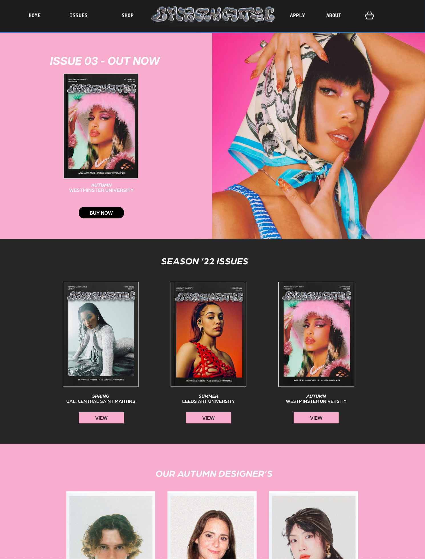
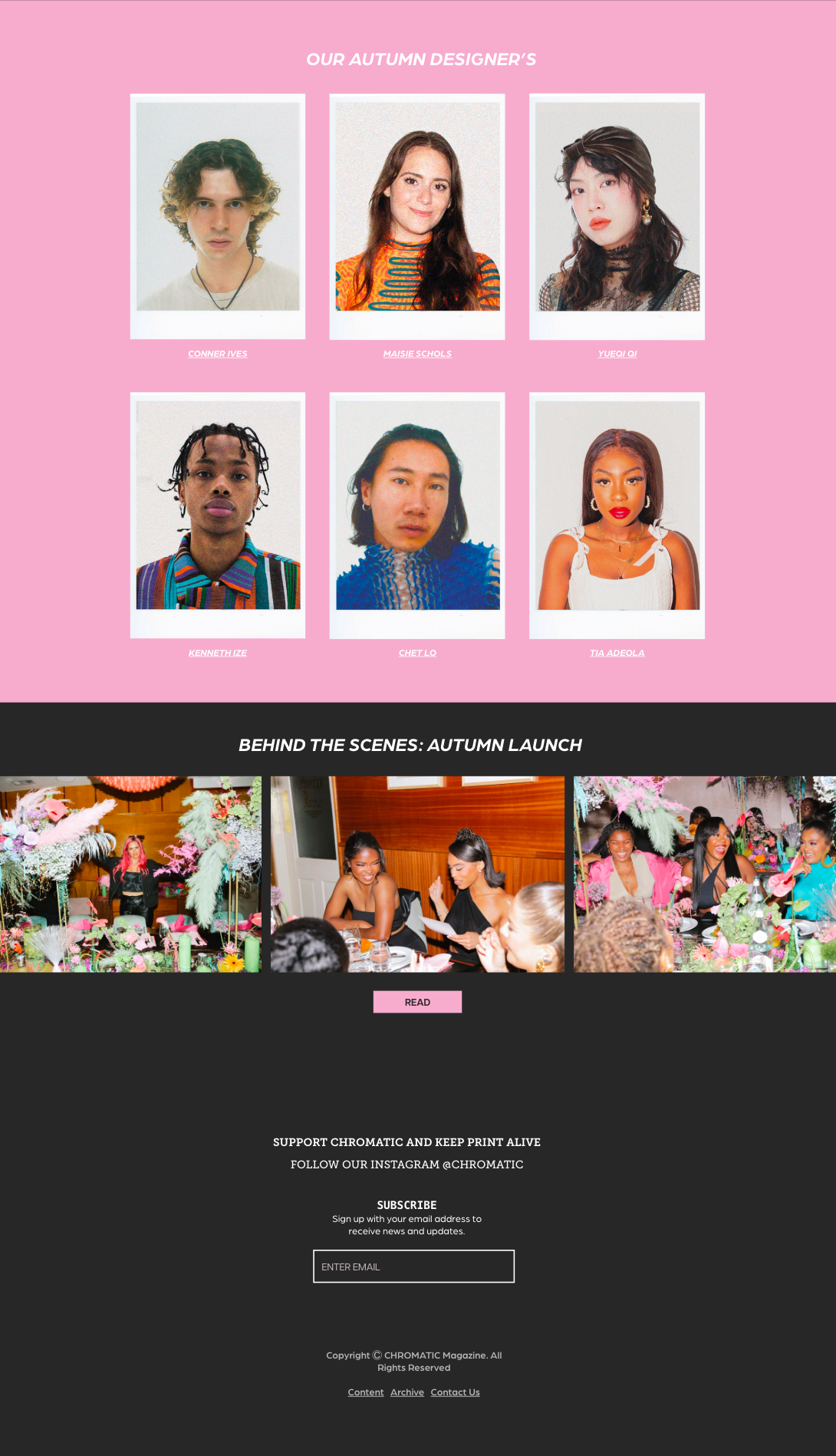
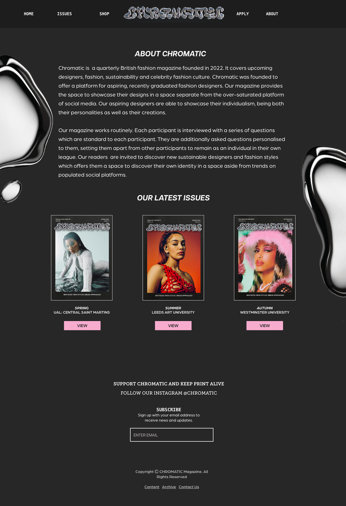
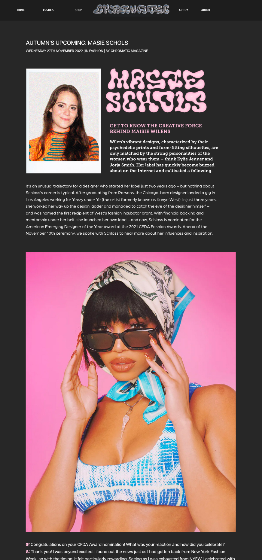
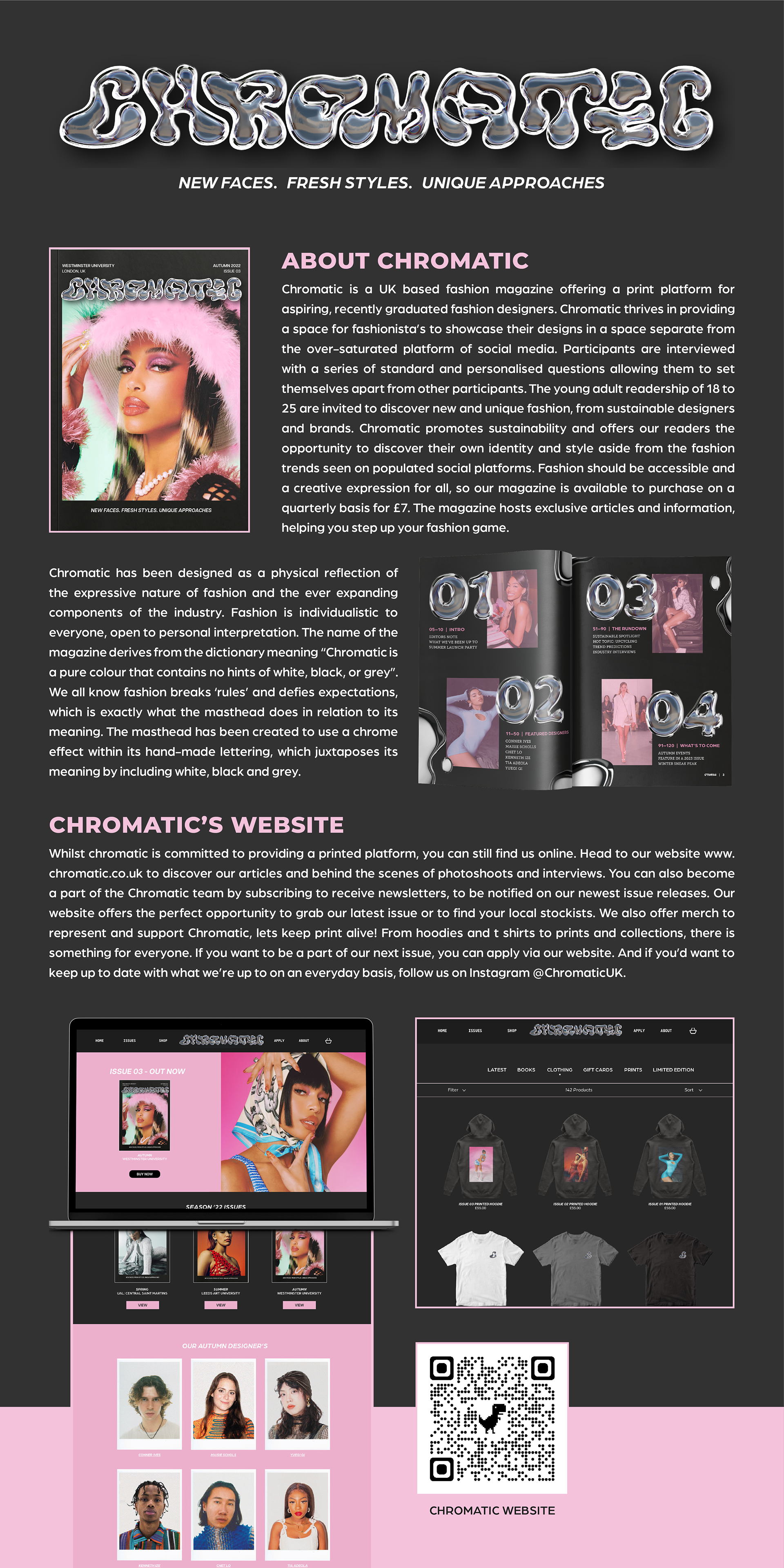
Chromatic has been created to offer a dedicated printed platform, however you can still find them online via a website and social media in order to not limit the access. They provide a web format of the featured designer articles along with exclusive articles showcasing behind the scenes of photoshoots and interviews. The online presence has been designed to mirror and emulate the print version through colours, typography and image treatment which remains similar or the same. This is to maintain brand recognition across platforms whether this be print or social media. A service available online is the application process of being part of an upcoming issue. The significance of this area of the website has been shown through hierarchy of the placement of the apply button which is on the header which ‘follows’ the reader throughout their interaction with the website.
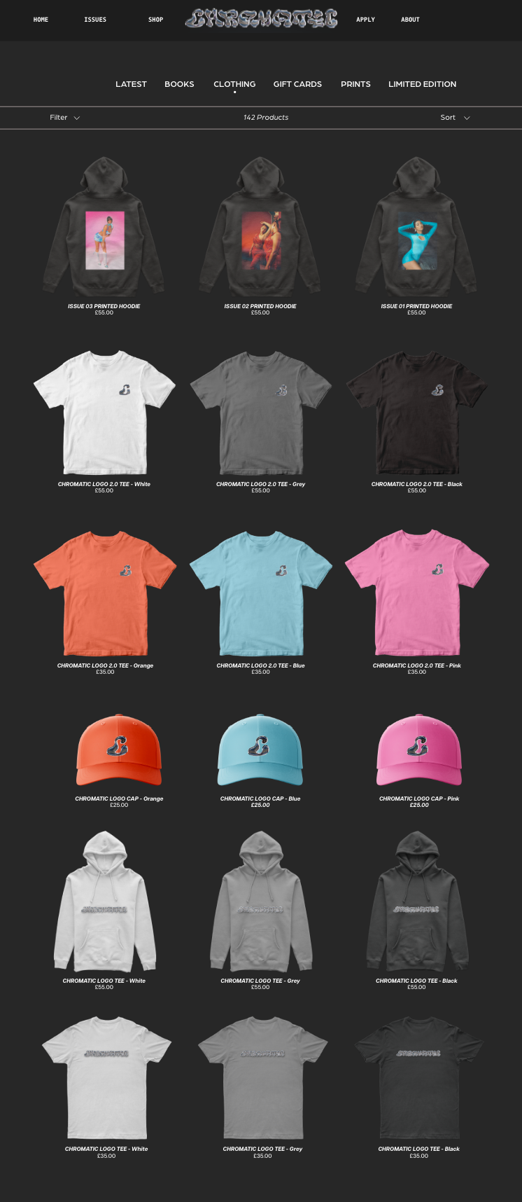
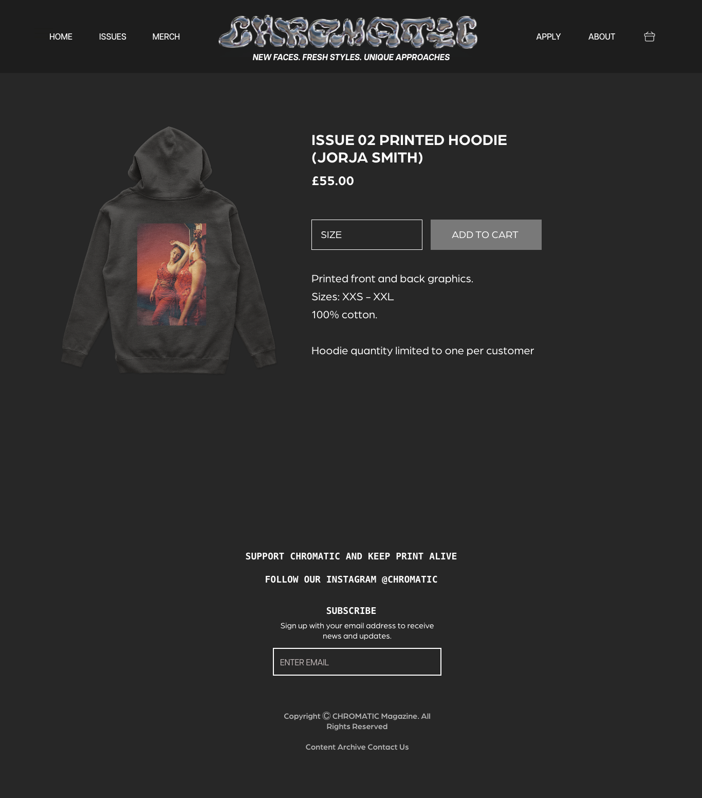
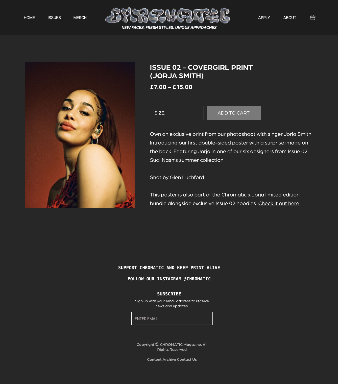
Consistent across the web design as with the print, is the black background. It has been used to maintain the vibe emulated from the print and allow for imagery and typography to stand out. The chromatic website is primary for allowing readers to interact with the magazine online which leads them to purchase an issue and become a support of Chromatic. The ‘SHOP’ section of the site is dedicated to offering a wide range of items for those who want to read their first copy or those who want to grab the latest merch drop. Readers are able to choose from an expanding range of clothes such as hoodies and t shirts in various colour ways as well as prints that correlate to the issues so far.
Social Media: Instagram
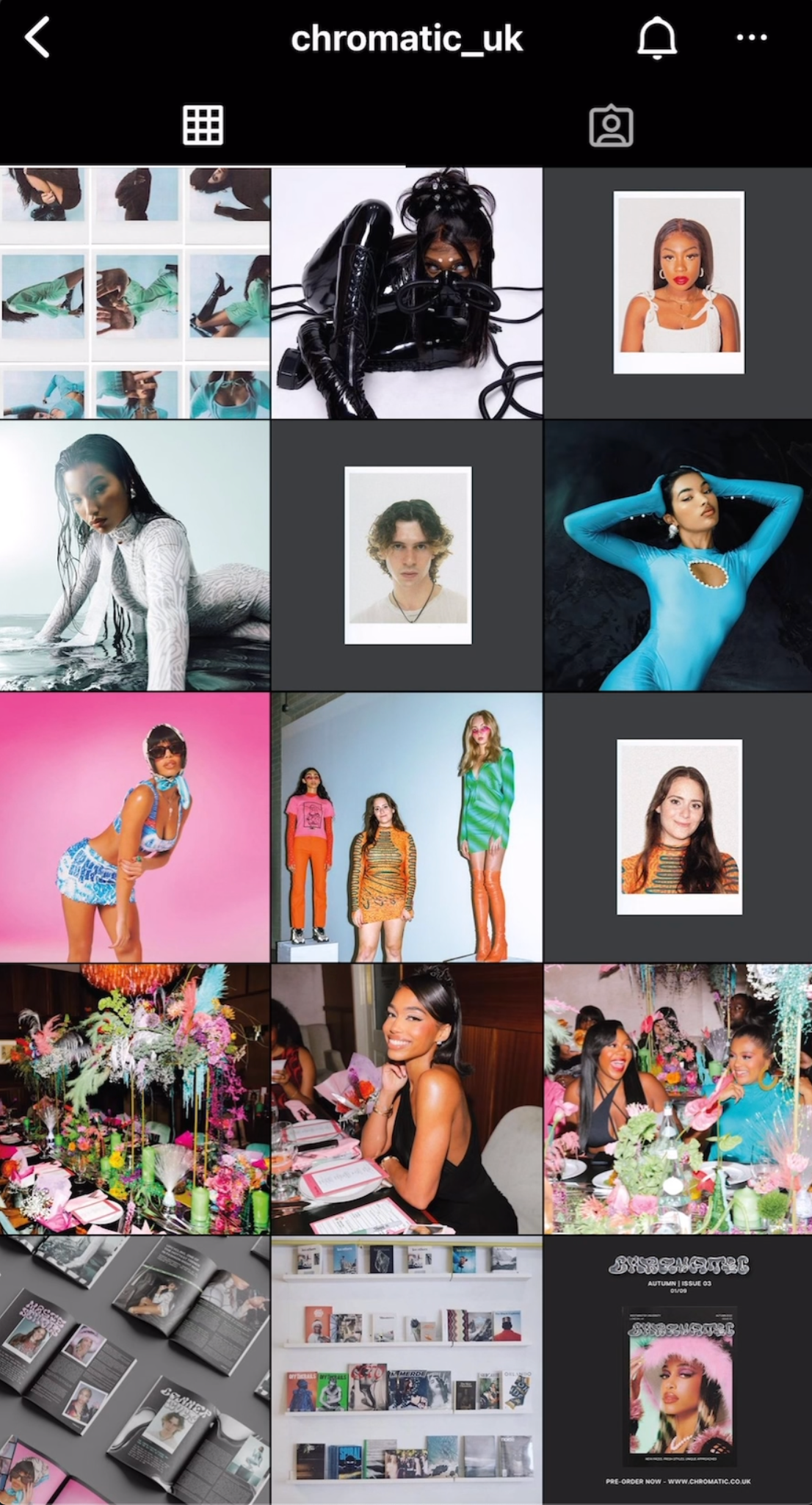
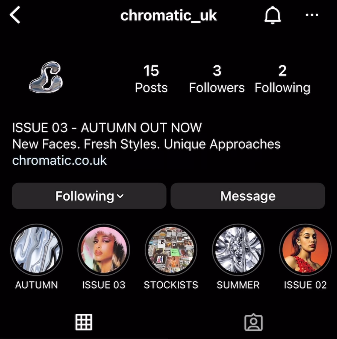
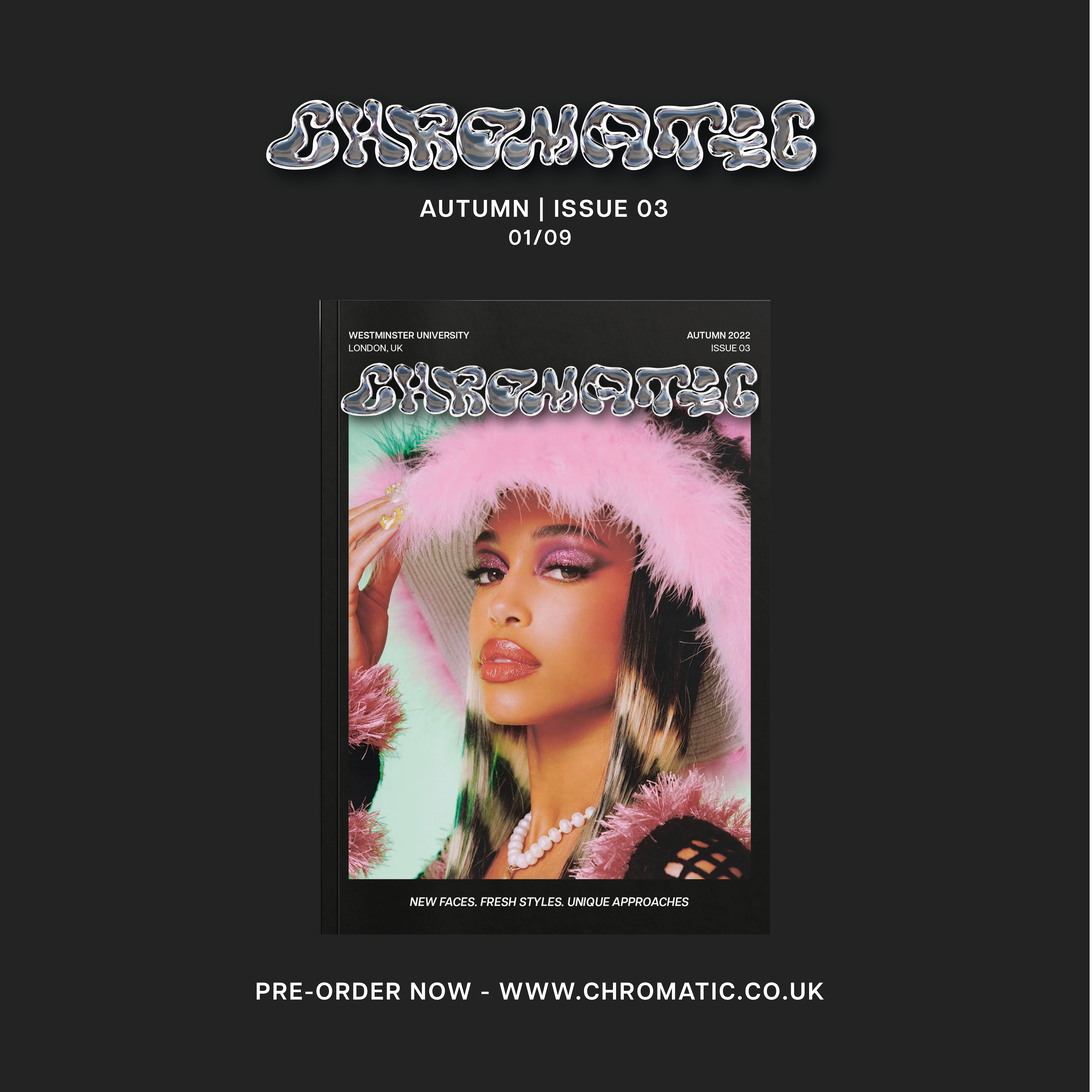
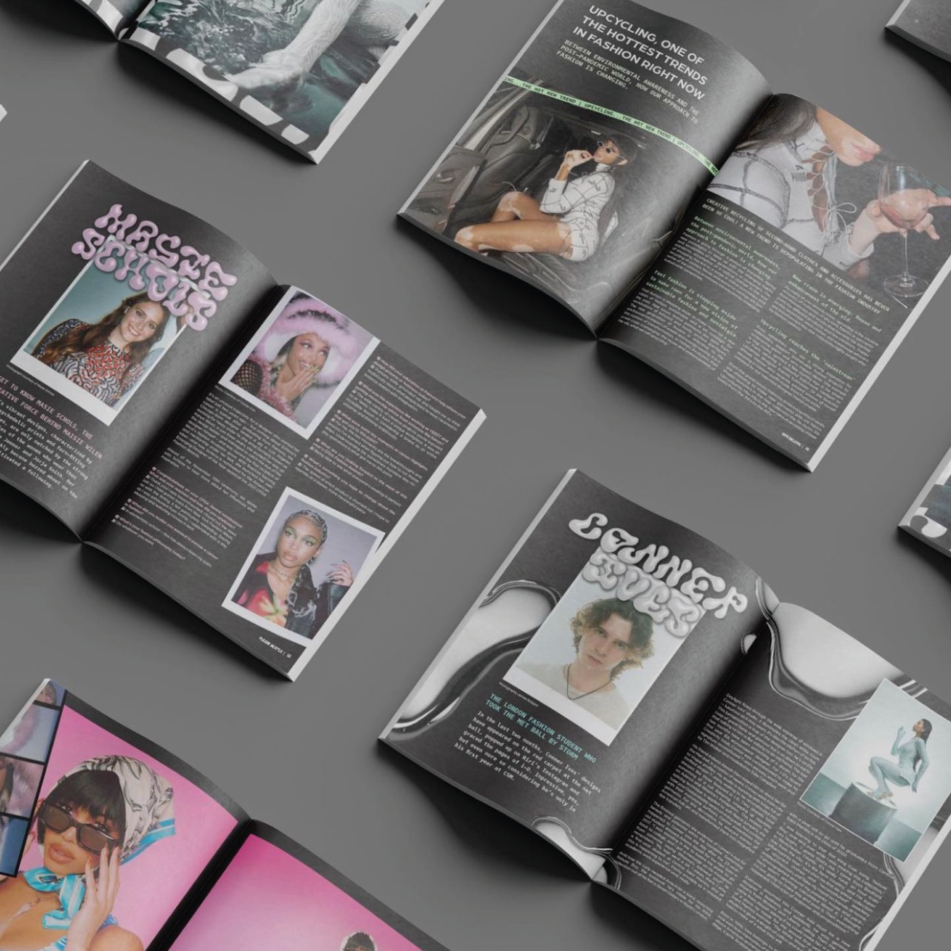
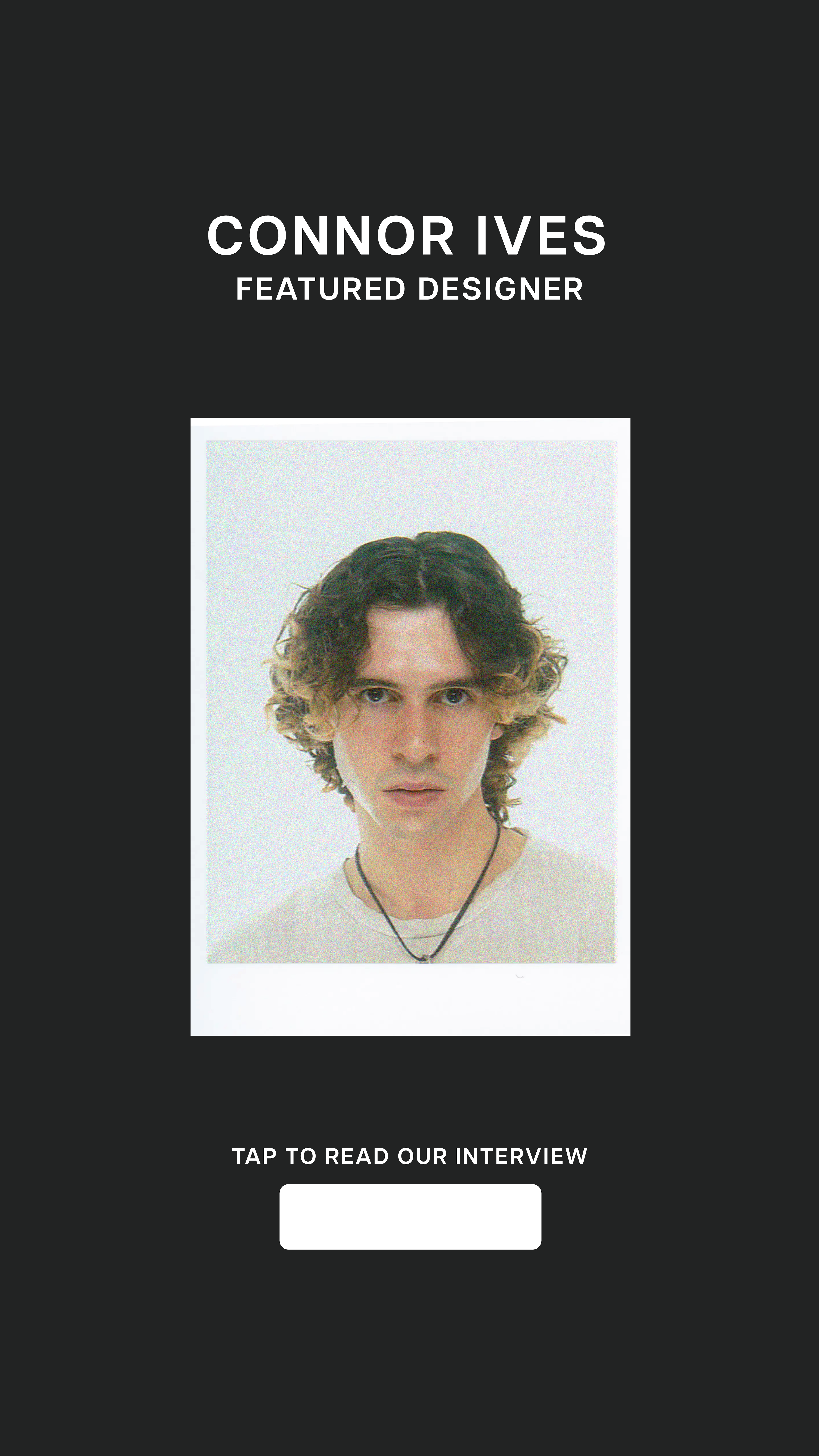
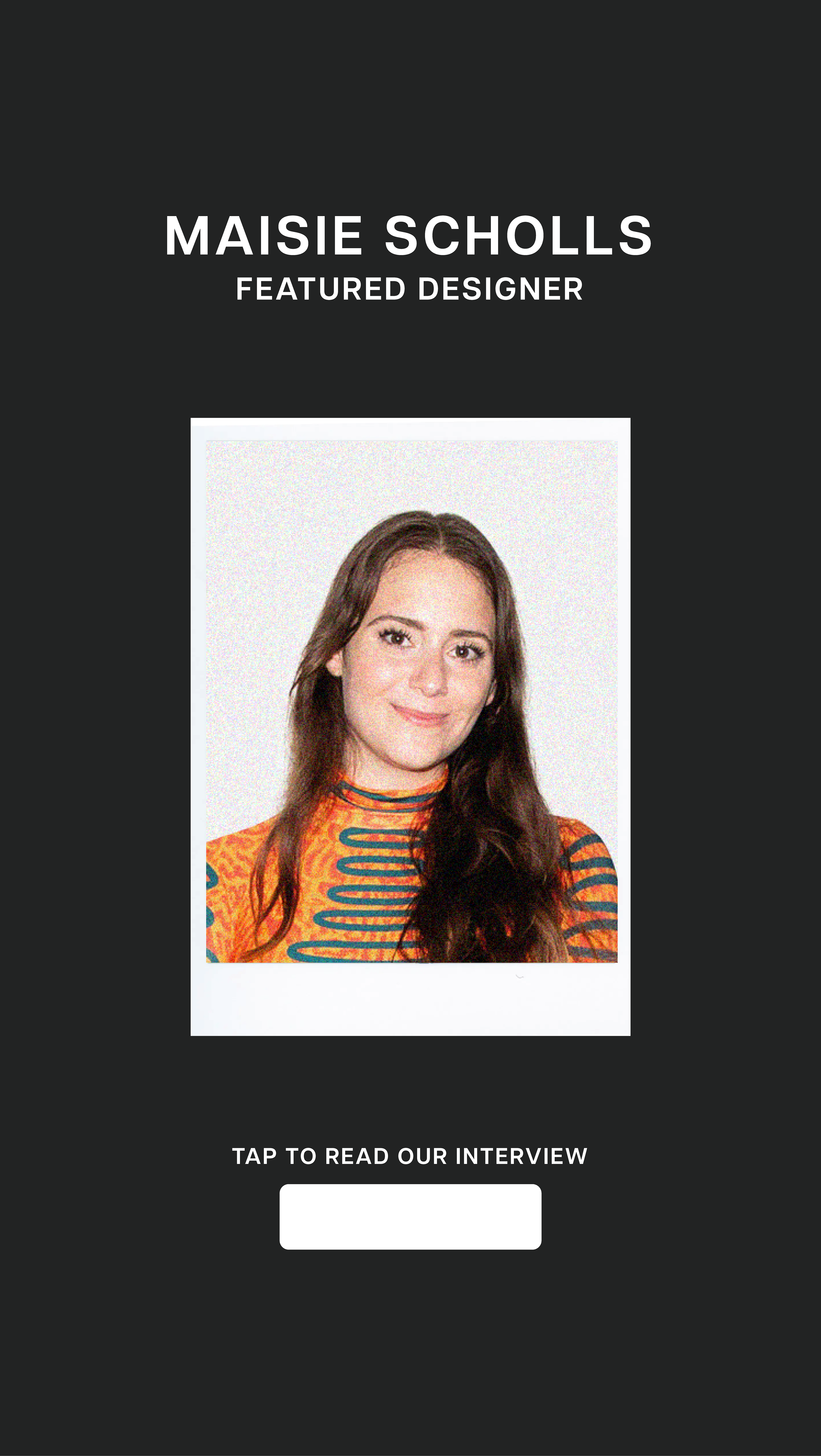
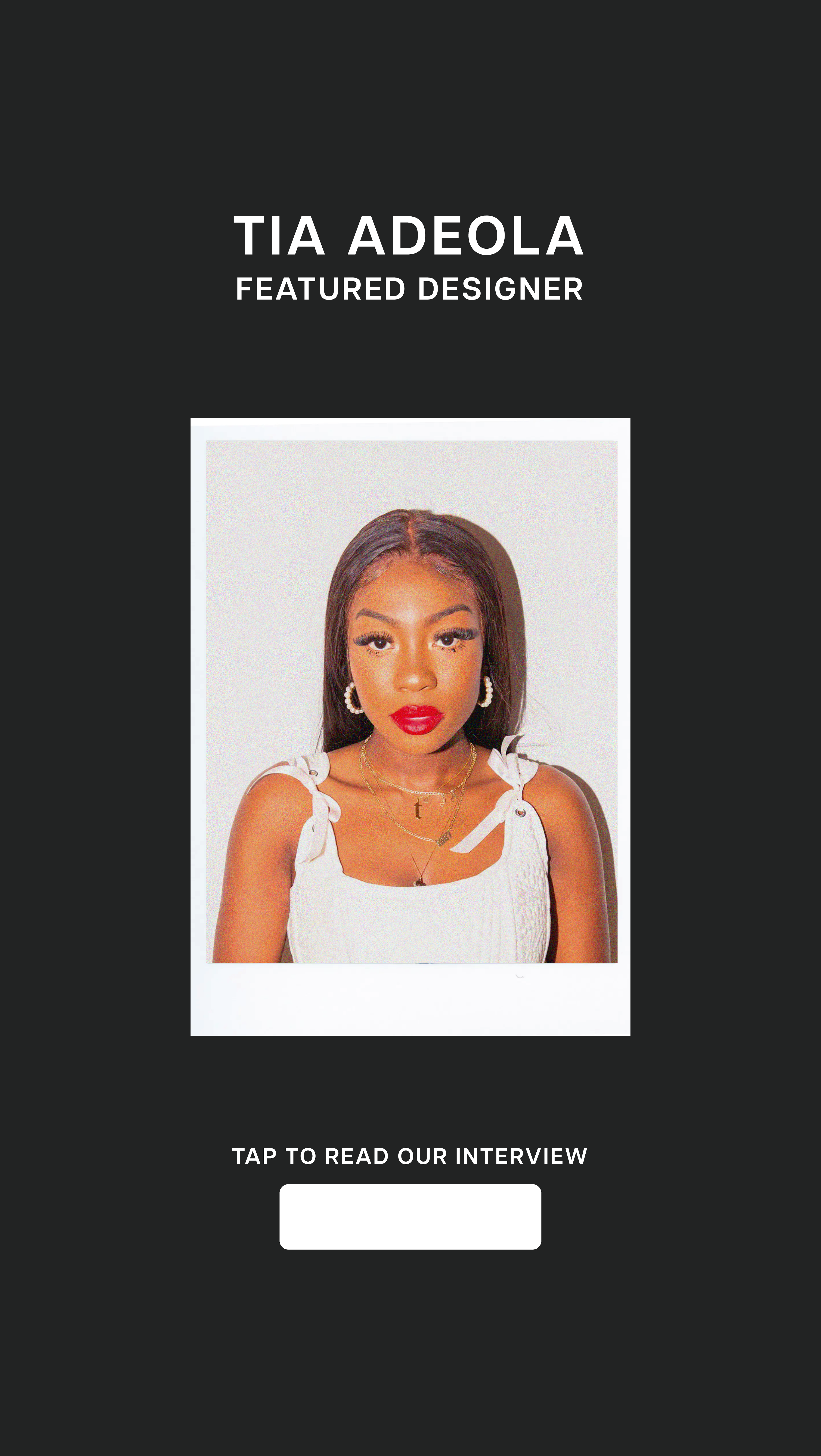
The black background stylistic approach has also been maintained for the social media presence with promotional material created using the same colour palettes and typography. The following outlines the instagram grid and the system it follows for an effective approach to social media for Chromatic and their social goals. The ‘beginning’ of the Chromatic feed promotes the latest release of issue 3 . The next 2 following posts share updated stockists and a sneak peak into the inside pages to influence the target audience to check it out. The following 3 posts share behind the scenes photographs from the Autumn, Issue 03 celebratory Launch. This has been included on social media to invite the readers to personally feel a part of Chromatic in many ways.
After the promotion of the latest issue, the Chromatic grid proceeds to follow a routine post schedule that the audience will become familiar with, but with the content updating each week. Prior to the release of the issue, Chromatic will begin promoting the designers featured in the magazine. Post one shares an image of the designer, stylised as a polaroid to mirror the approach in the magazine itself. This is then followed by two carousel posts sharing the designers chosen fashion pieces or collections. This provides online exposure for the recent graduate, allowing them to reach the target audience on both print and online media. This feed order continues consistently with the only adjustment seen when the next artist is post. One of the images of their work is posted prior to the polaroid picture of them in order to avoid the feed looking repetitive in one row.
MAGAZINE PITCH
