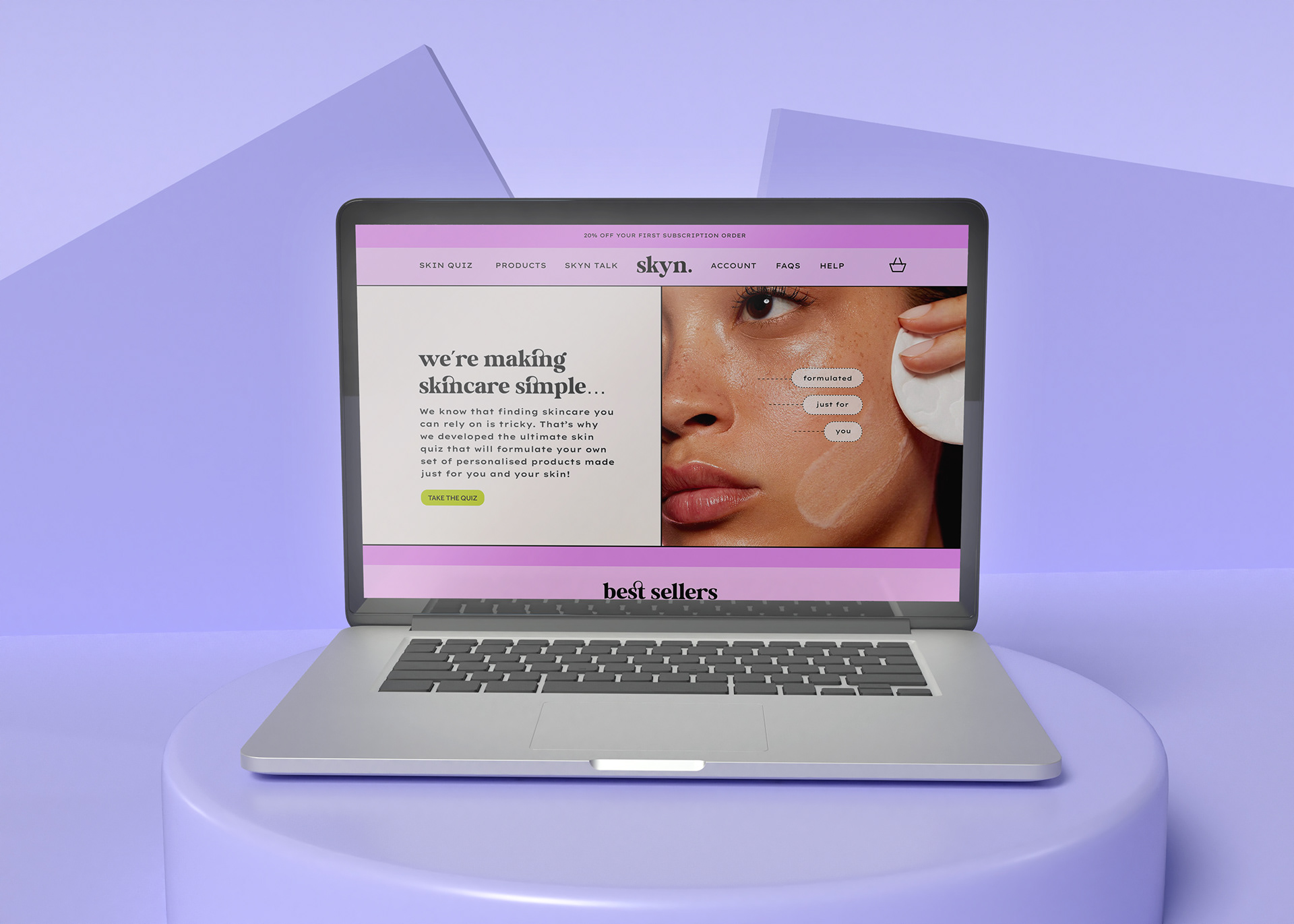
Skyn - Website Display
Skyn - Mobile Display
HOMEPAGE - WEB AND MOBILE DISPLAY

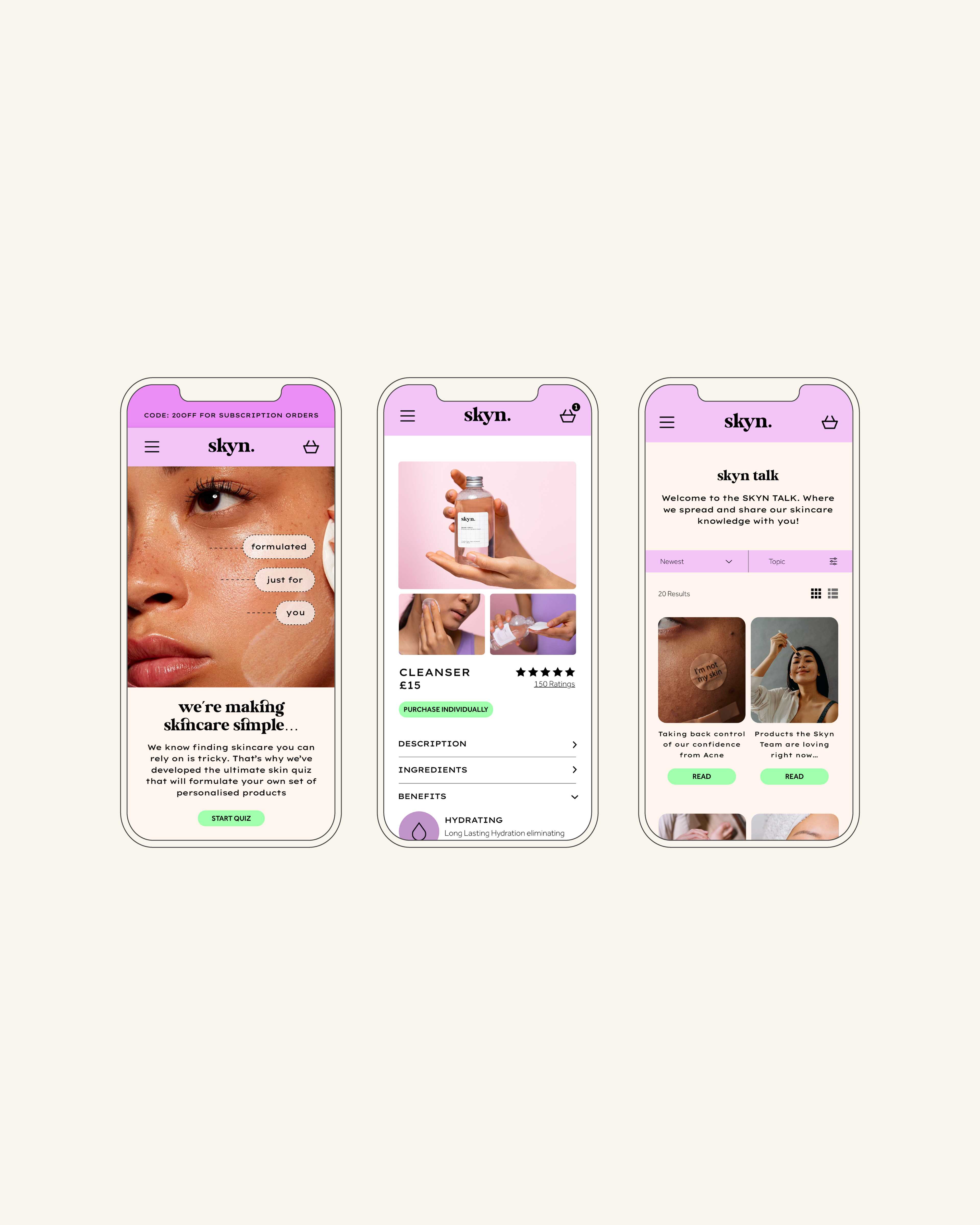
SKYN - Mobile Homepage
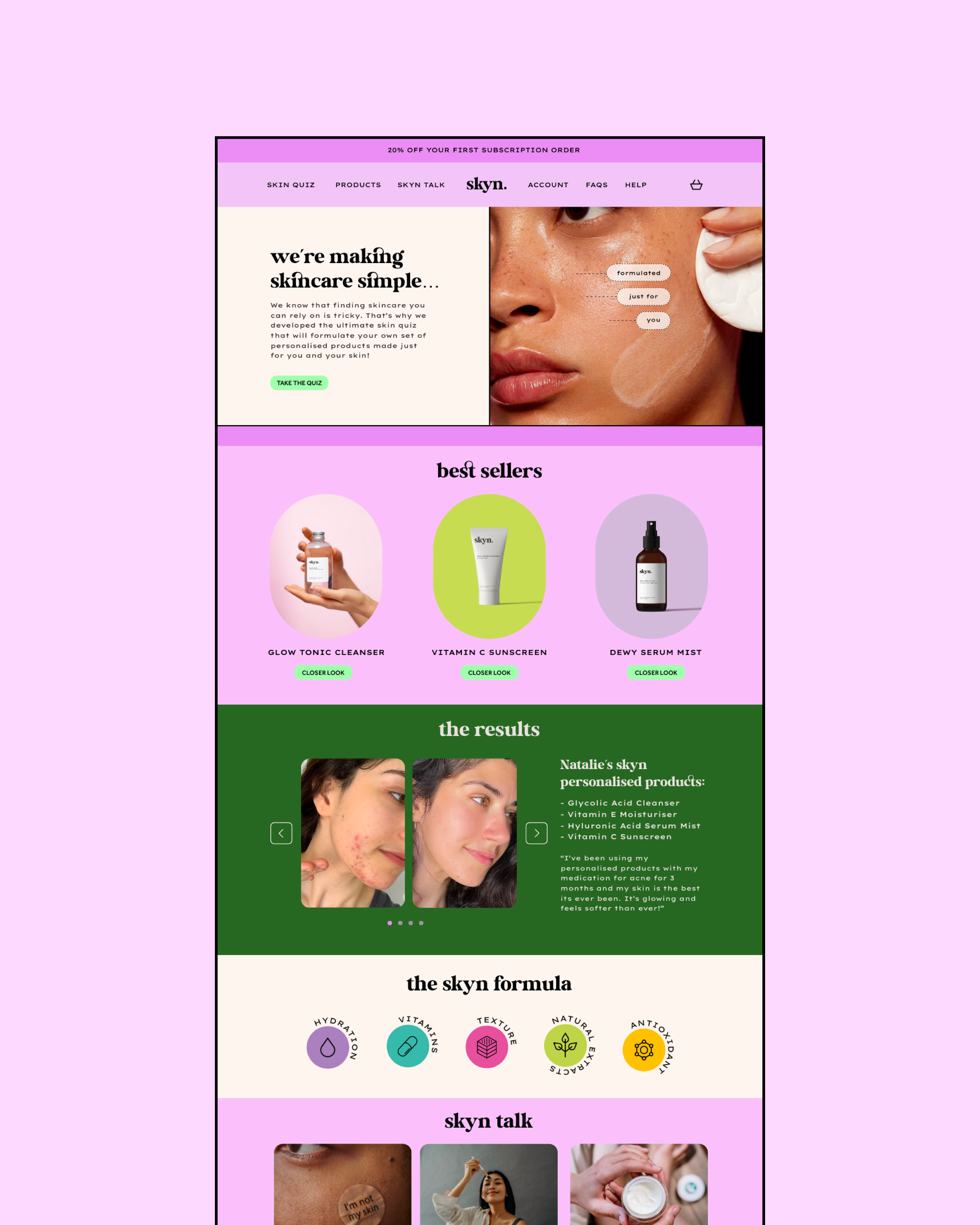
SKYN - Web Homepage
Skyn Homepage - Web and Mobile
Features on Mobile vs Web:
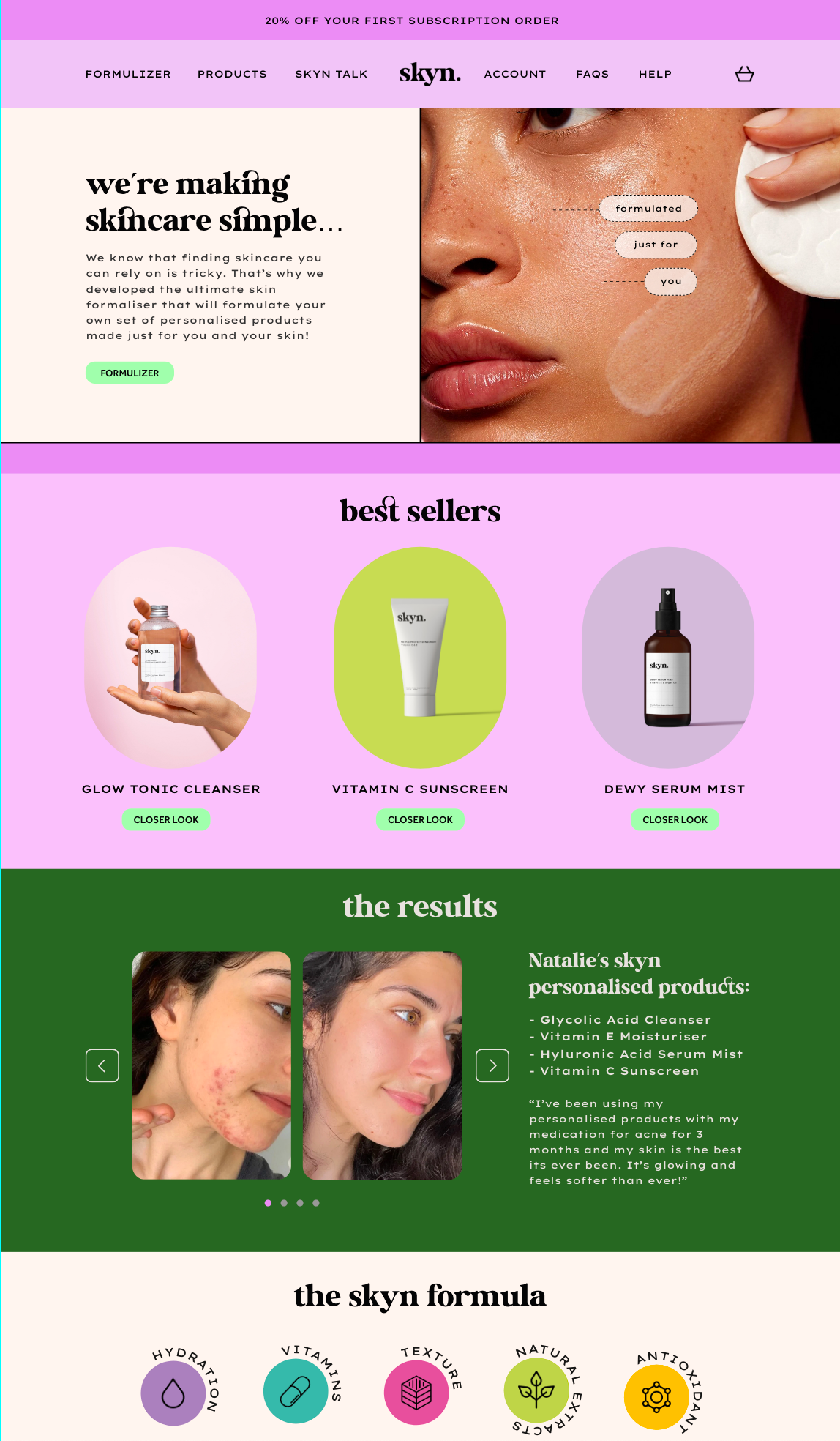
The overall layout of the mobile screen offers additional features to compensate for the reduced space. The navigational heading on the site has been reduced to a menu access through the burger menu icon. This has allowed for these breakpoints to be accessed and displayed in the smaller space at a legible scale. The best sellers are reduced in the mobile version as opposed to the web in order to avoid the user having to scroll for an extended period of time to get to the next part of the site.
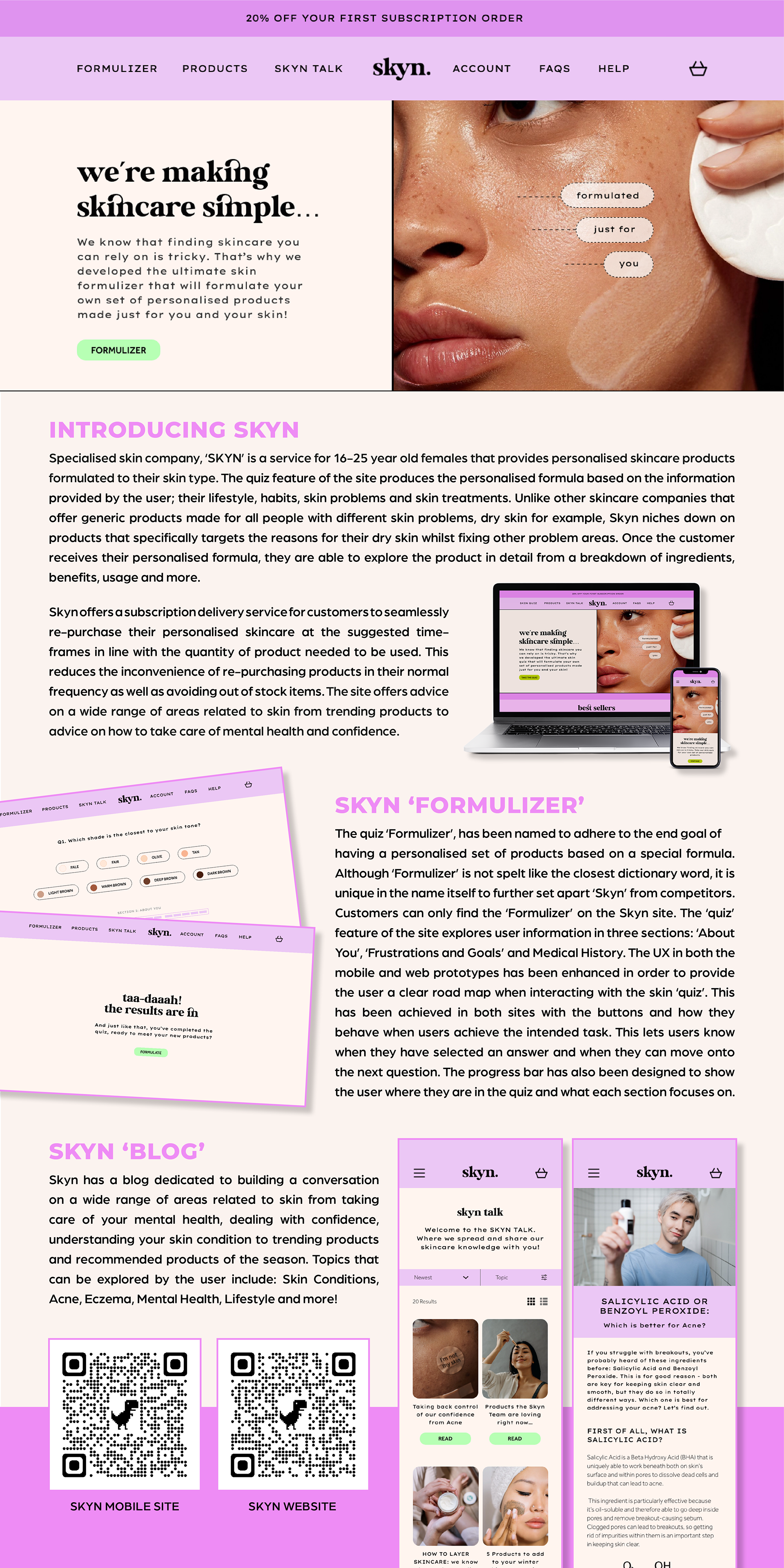
Language: The ‘Formulizer’, the name adheres to the end goal of having a personalised set of products based on a special formula. Although ‘Formulizer’ is not spelt like the closest dictionary word, it is supposed to be unique in the name itself to further set apart ‘Skyn’
from competitors. Customers can only find the ‘Formulizer’ on the Skyn site.
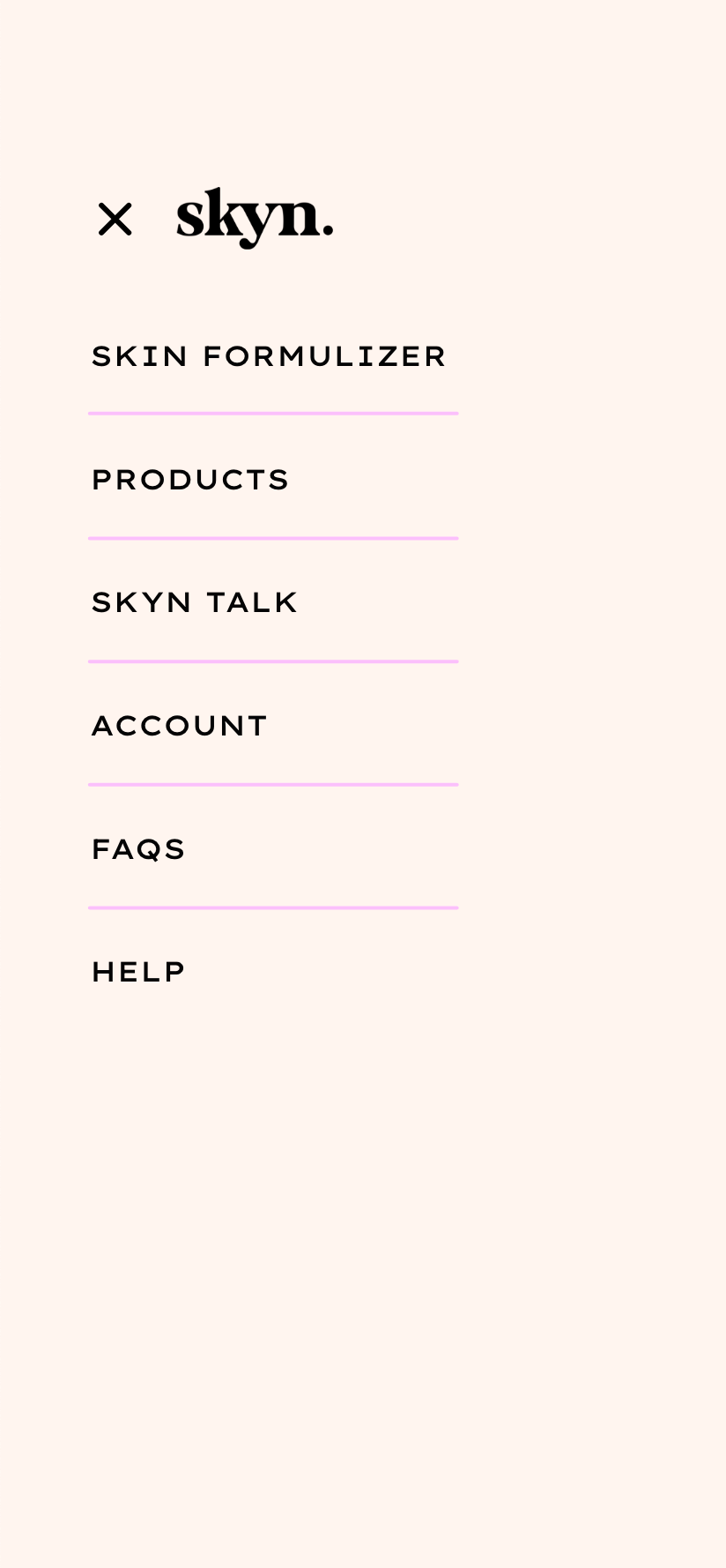
Navigation: The user experience and usability was further developed by making navigations to the homepage, formulizer and skyn talk click-able on every page. The burger menu now offers a more visually interesting UX transition when it is toggled from the initial navigational point. Additionally, users have been given a cross (X) to close the burger menu which was previously absent.
FORMULIZER
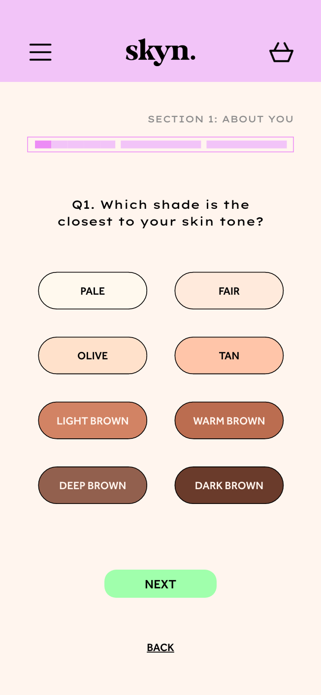
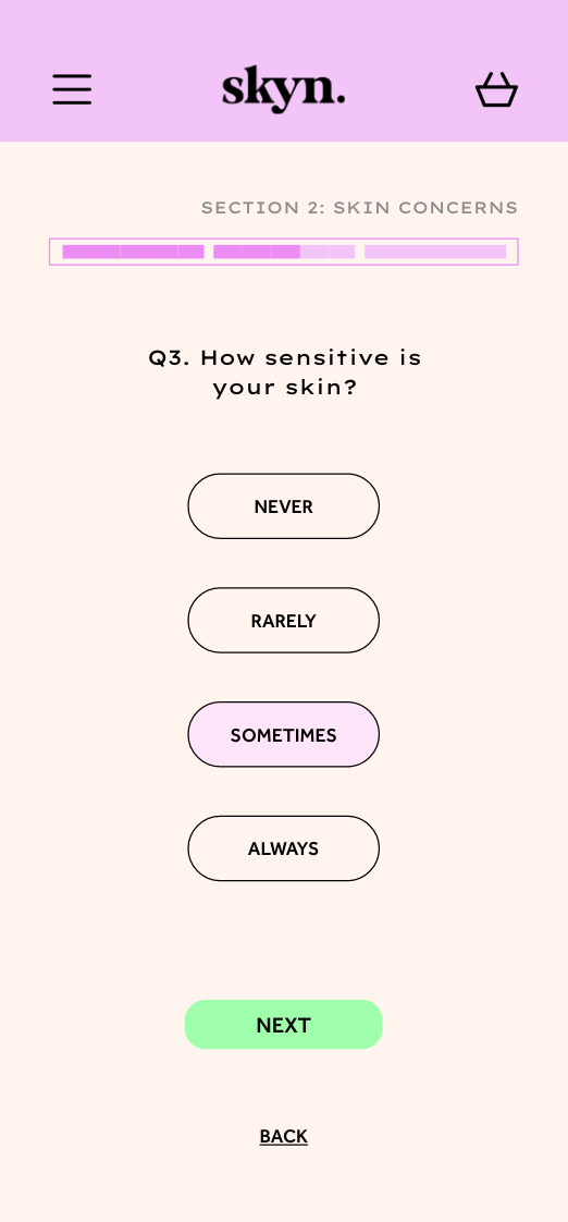
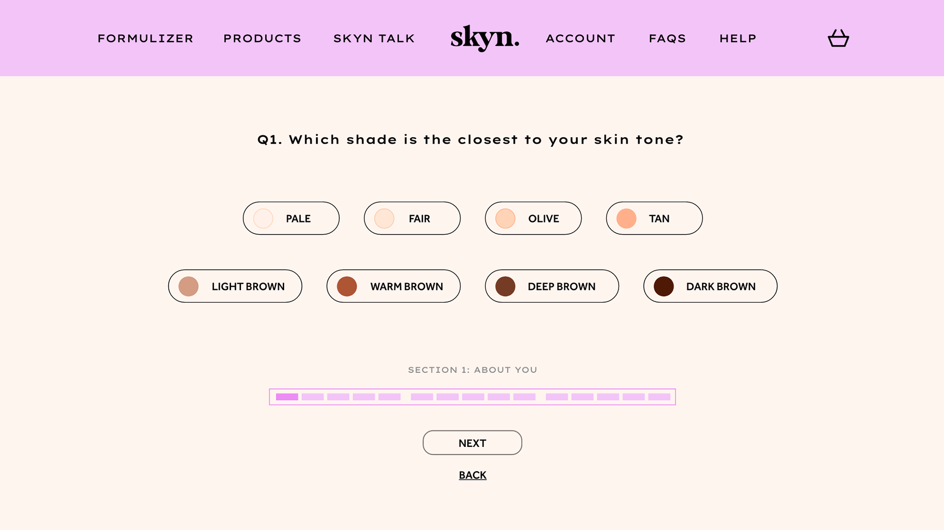
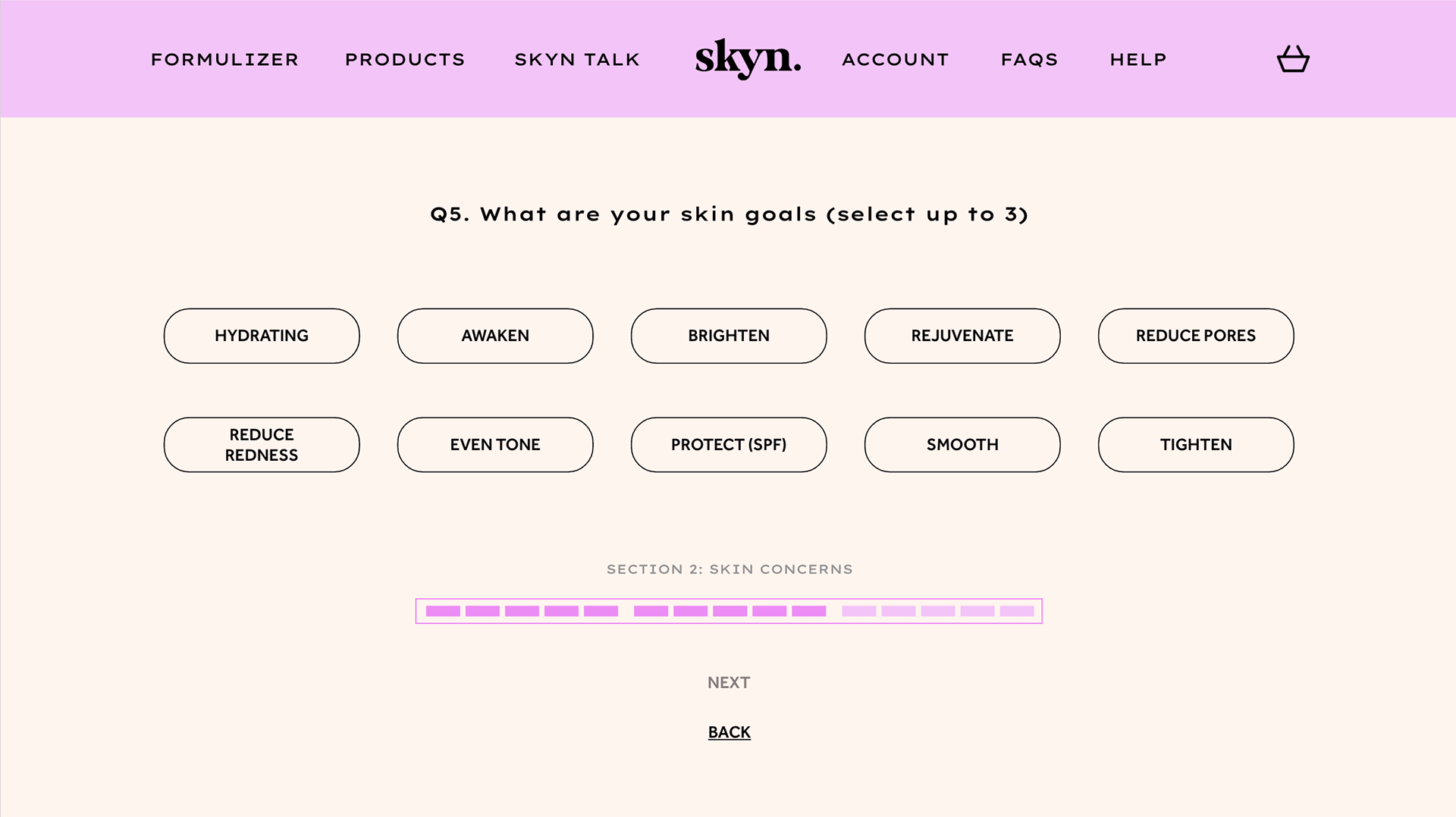
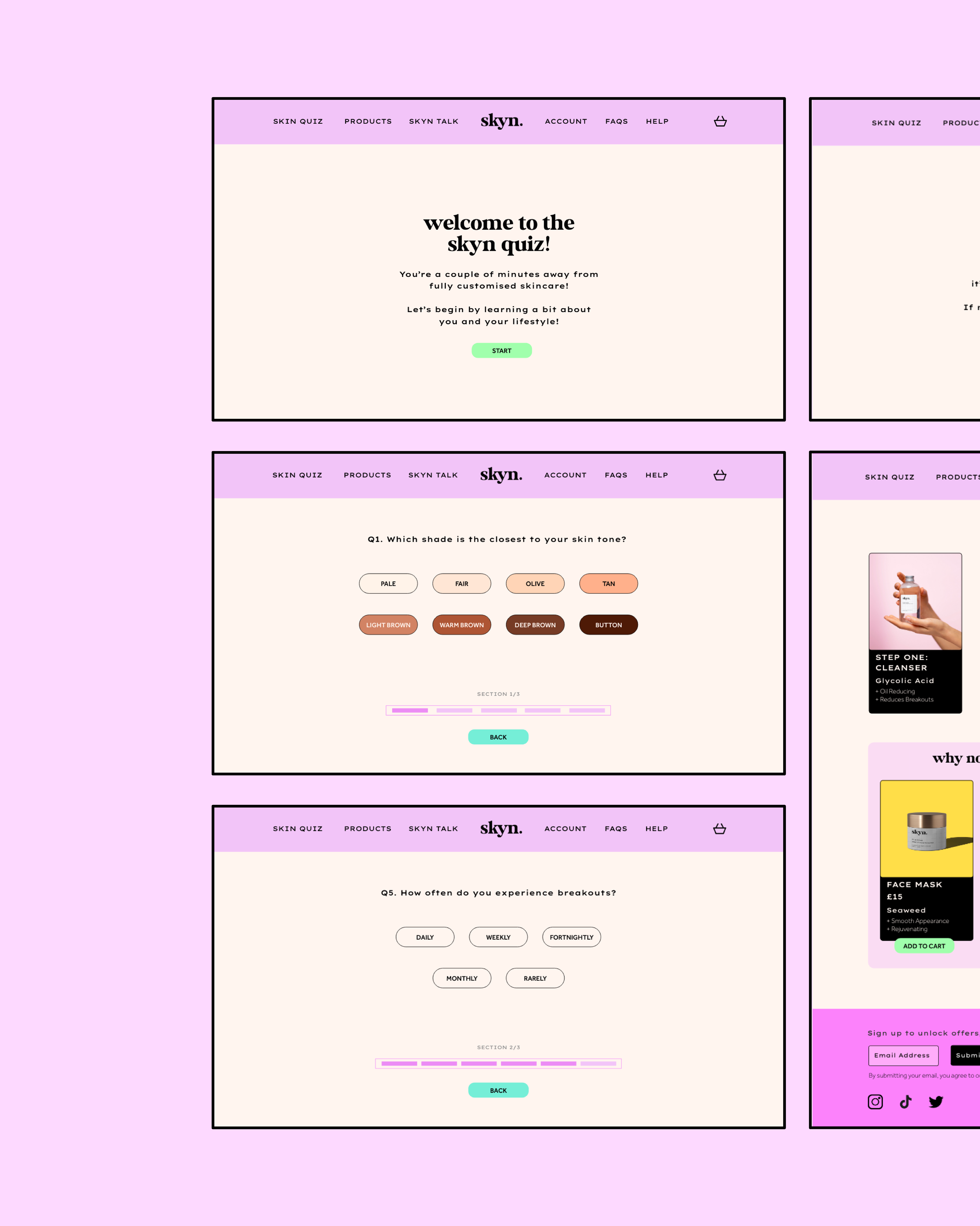
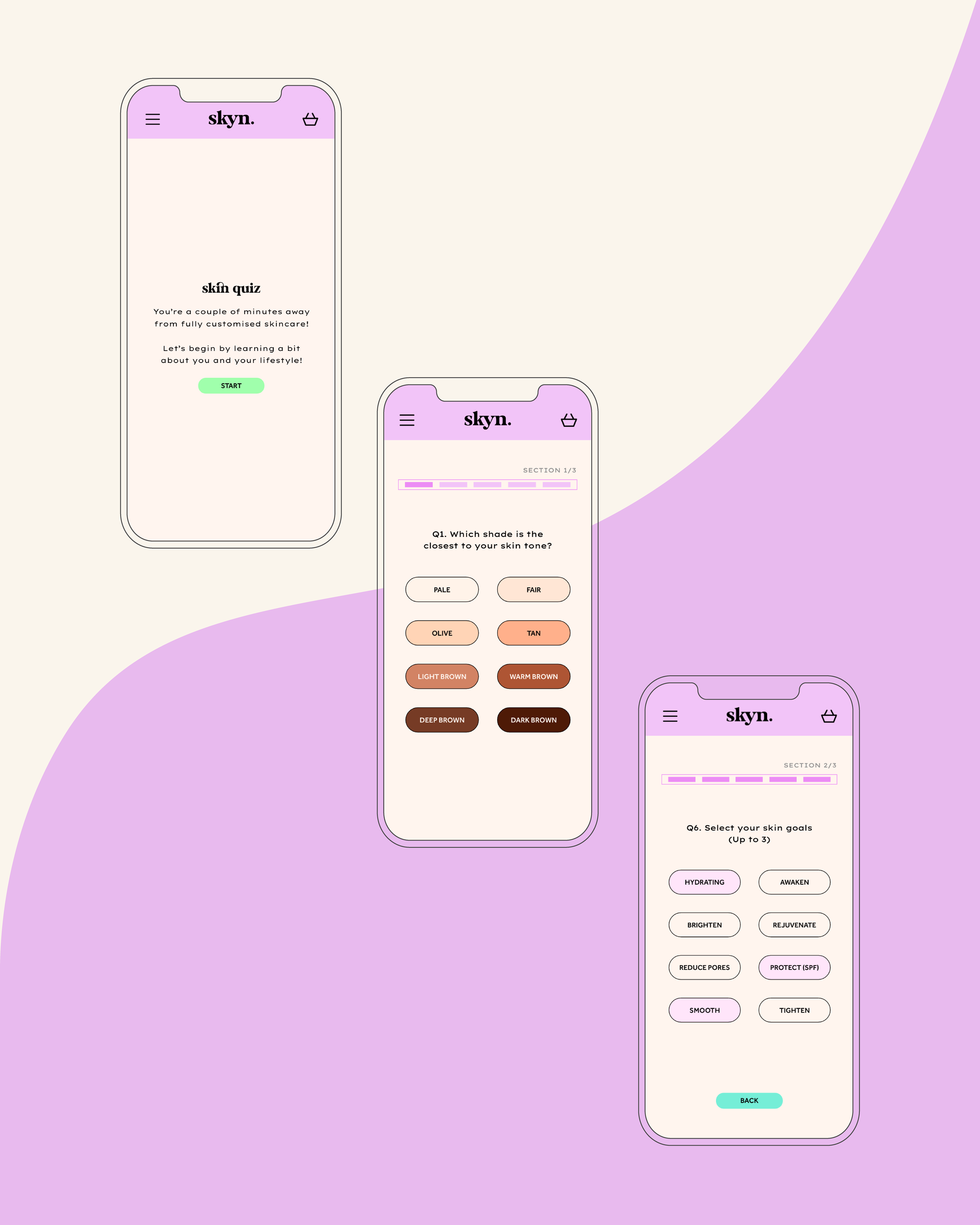
The UX in both the mobile and web prototypes has been designed to provide the user a clear road map when interacting with the skin ‘quiz’. This has been achieved in both sites by updating the buttons and how they behave when users achieve the intended task. This lets users know when they have selected an answer and when they can move onto the next question.
A hyperlink has been implemented to show users they can click on this button, without it looking identical to other buttons. On the mobile skin ‘quiz’, users can see their selected choice as the button changes to a pink shade. They can then proceed forward as the next button which was previously ‘greyed’ out, now becomes the green primary button they are familiar with. This approach has been applied yet adapted accordingly to the web display. It now integrates a hover state allowing users to see where they can click and the toggled state on the selected answer. The next button additionally lights up once users are ready to move onto the next question when hovered over.
The progress bar has been designed to show the user where they are in the quiz and what each section focuses on. The appearance of the progress bar differs according to the space and size of both devices. Mobile uses solid bars, whereas web has sections for each question within the three stages.
PERSONALISED RESULTS
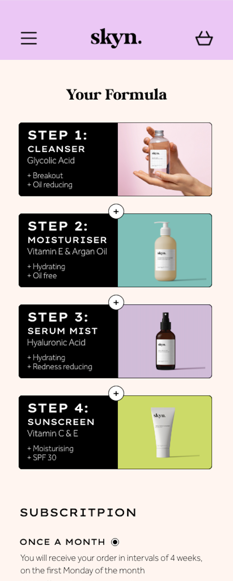
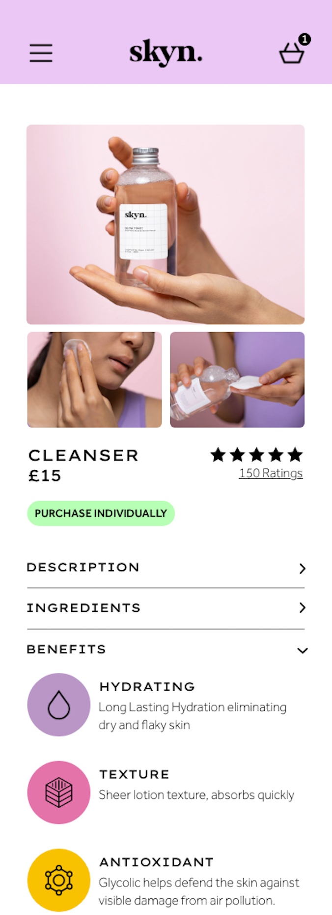
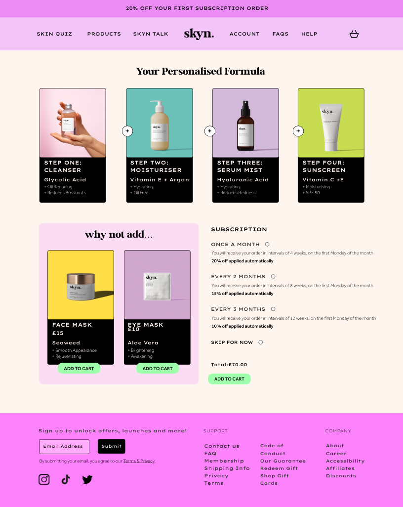
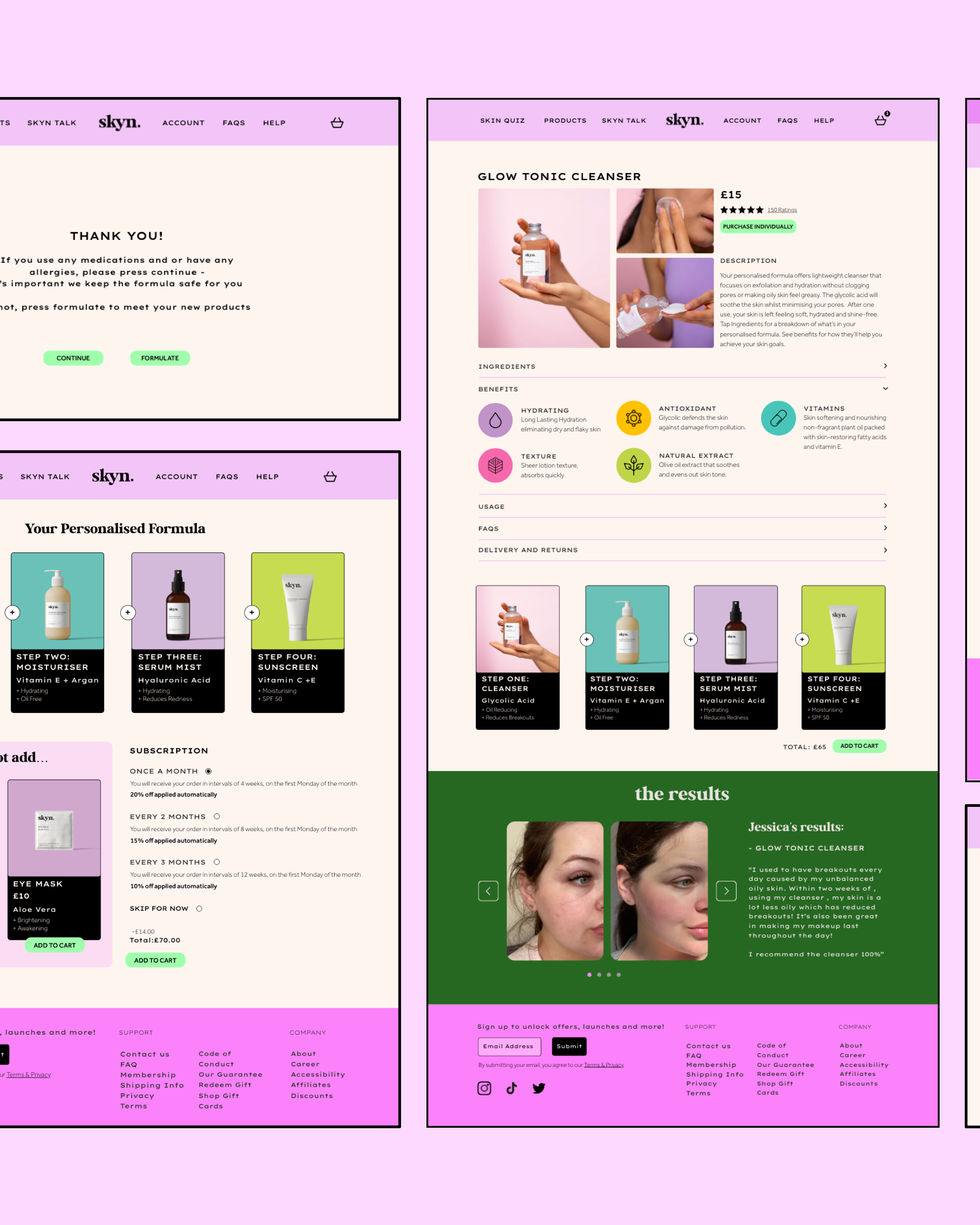
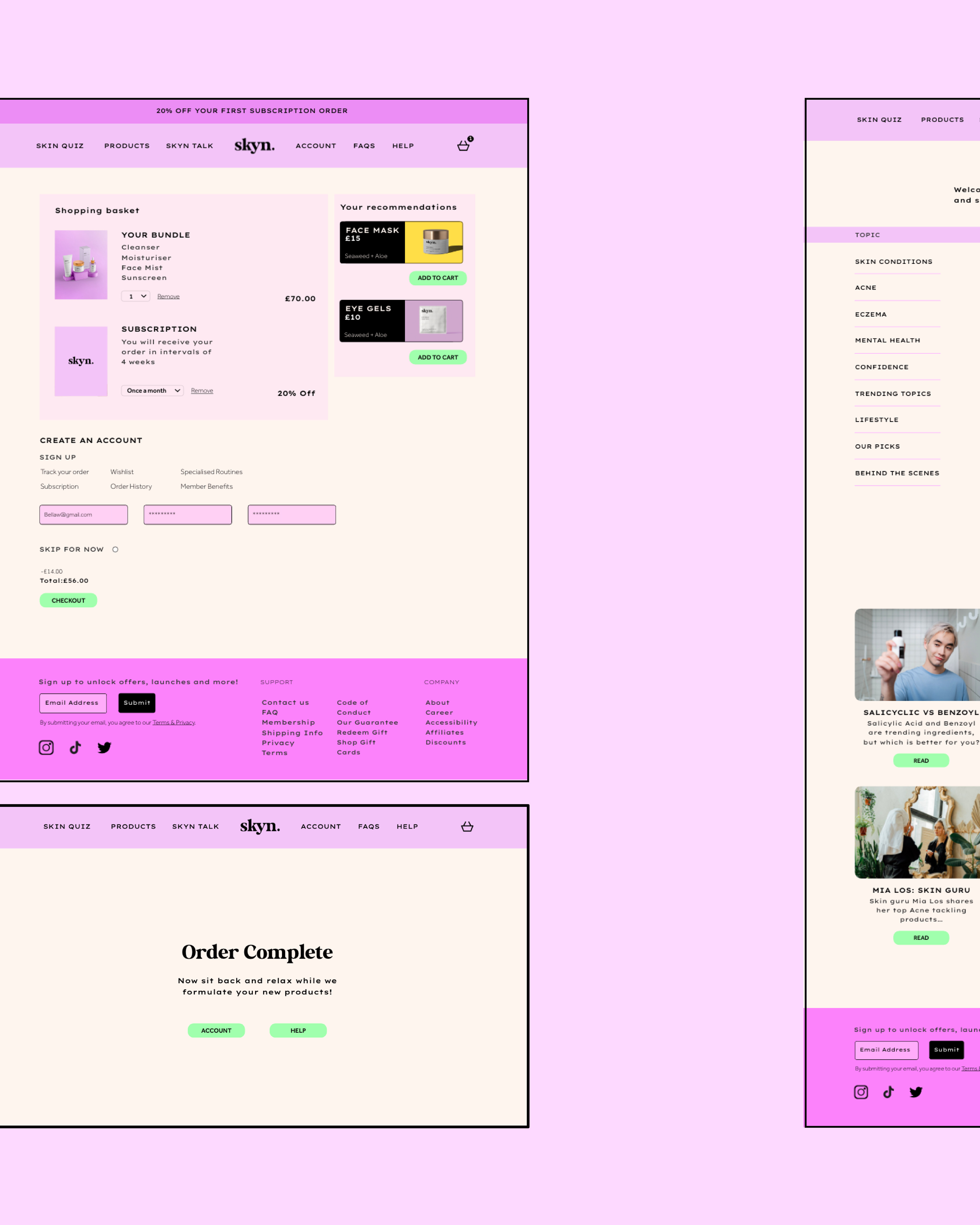
Personalised Formula Results (Mobile) Product Information (Mobile) Personalised Formula Results (Web)
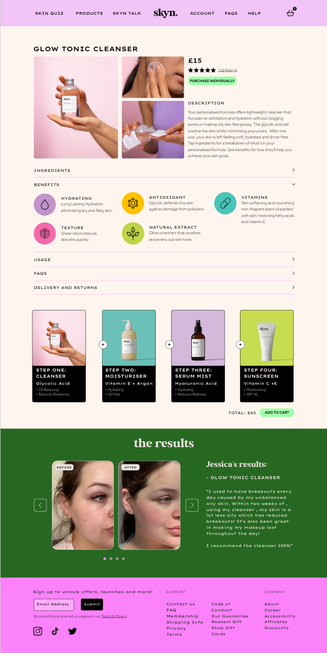
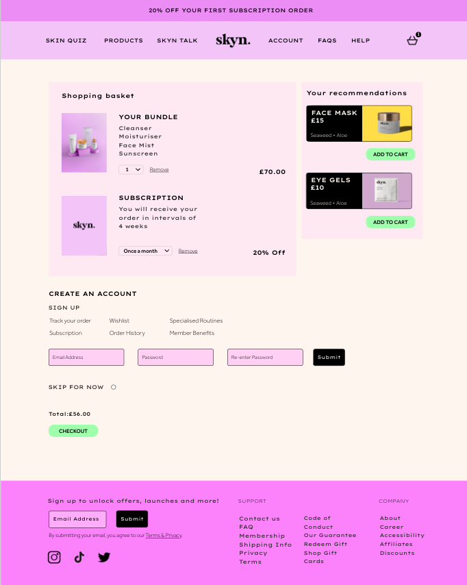
Product Information (Web) Basket (Web)
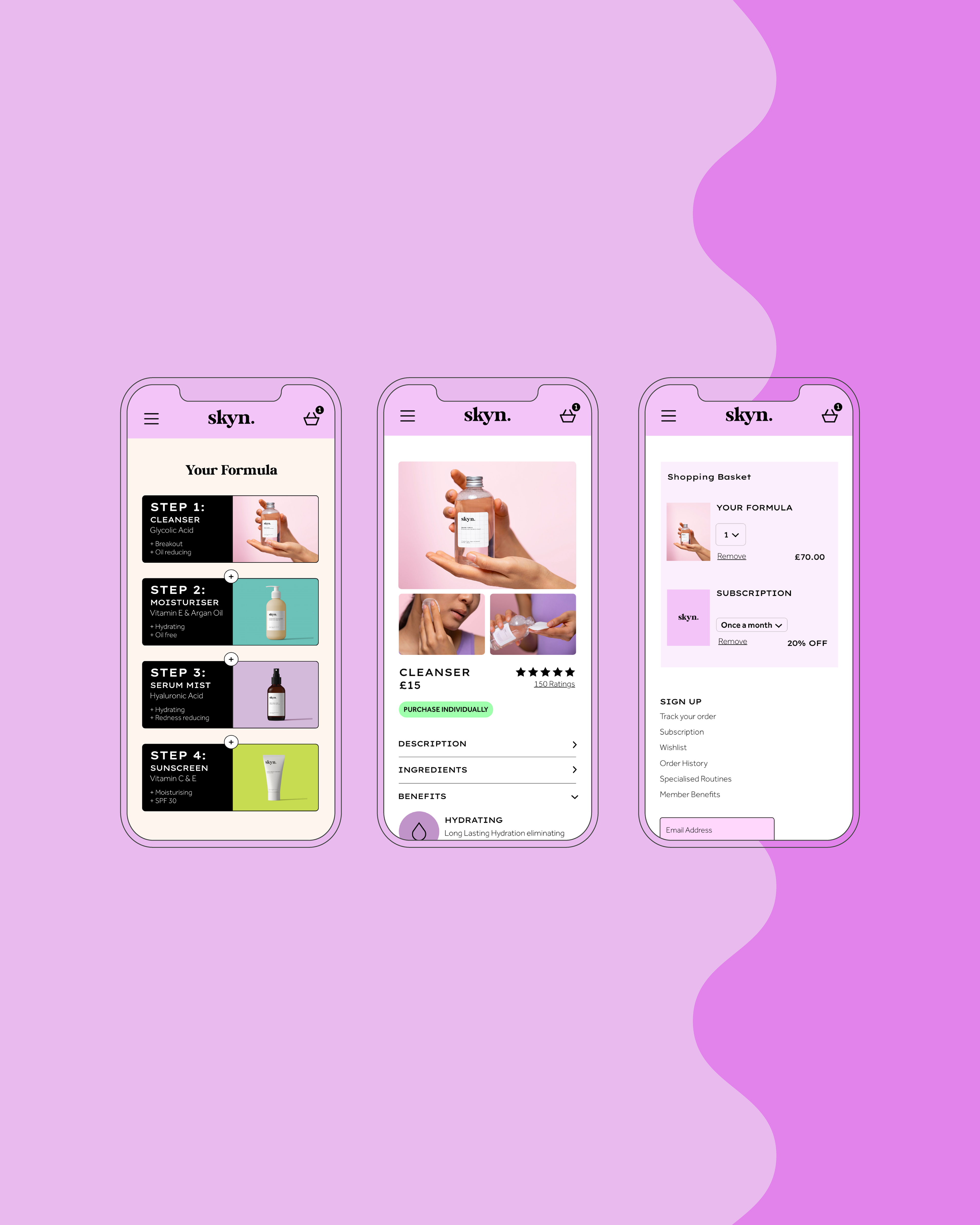
The grid conversion from web is reduced from twelve rows to four rows to fit the mobile display. The space across the mobile provides a wider space to display the product image and information which is presented in a horizontal arrangement. This is rotated in web but remains consistent through the visual approach. The colours and typography have been applied in the same manner in order establish consistency and build brand recognition for the users.
The personalized results are a direct outcome of the users answers with each product contains ingredients fit for their skin goals and pain points. For a more detailed look into each product, users are able to click on each product and look into the Ingredients, Benefits and Usage. They will find a detailed description of relevant information and understand why each ingredient is right for them.
SKYN TALK
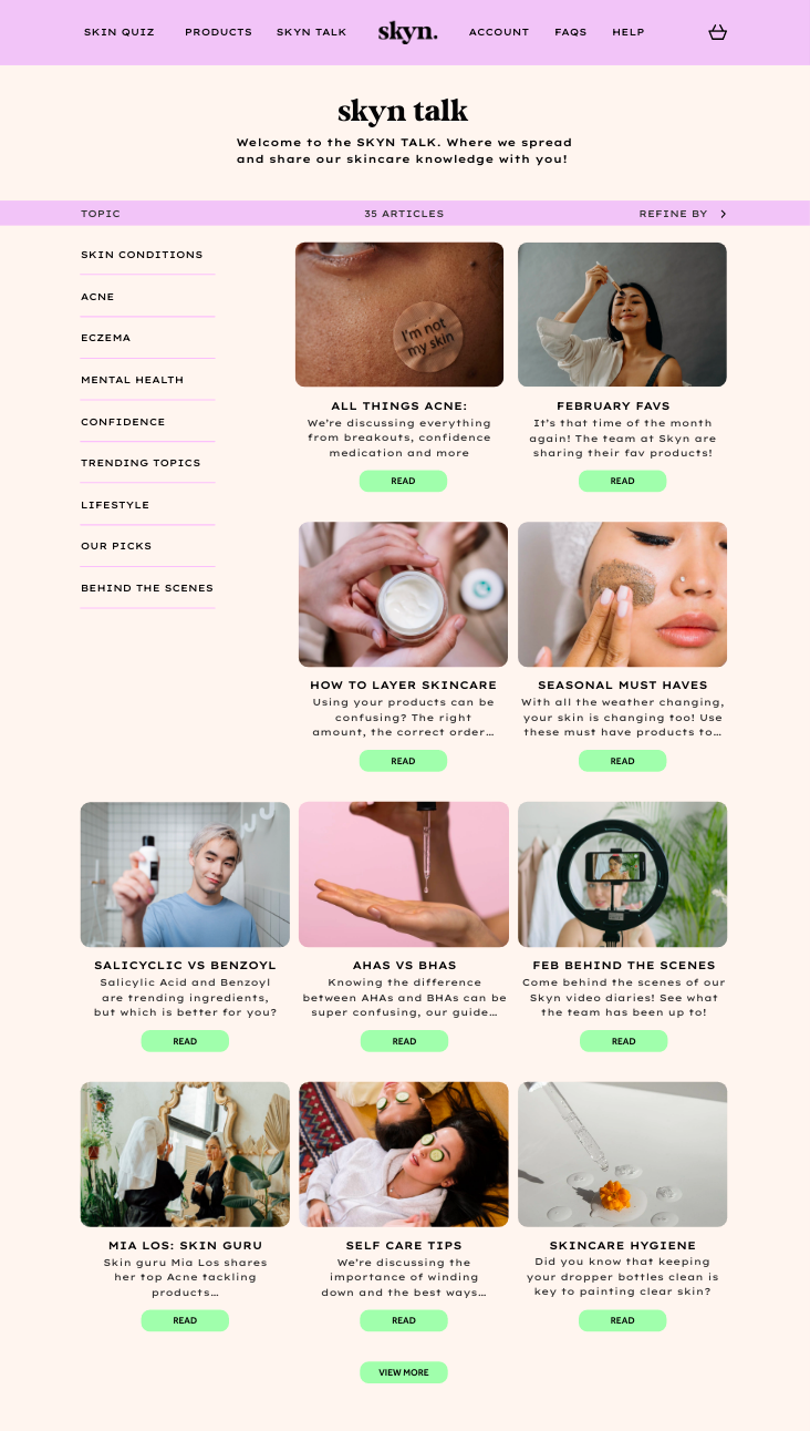
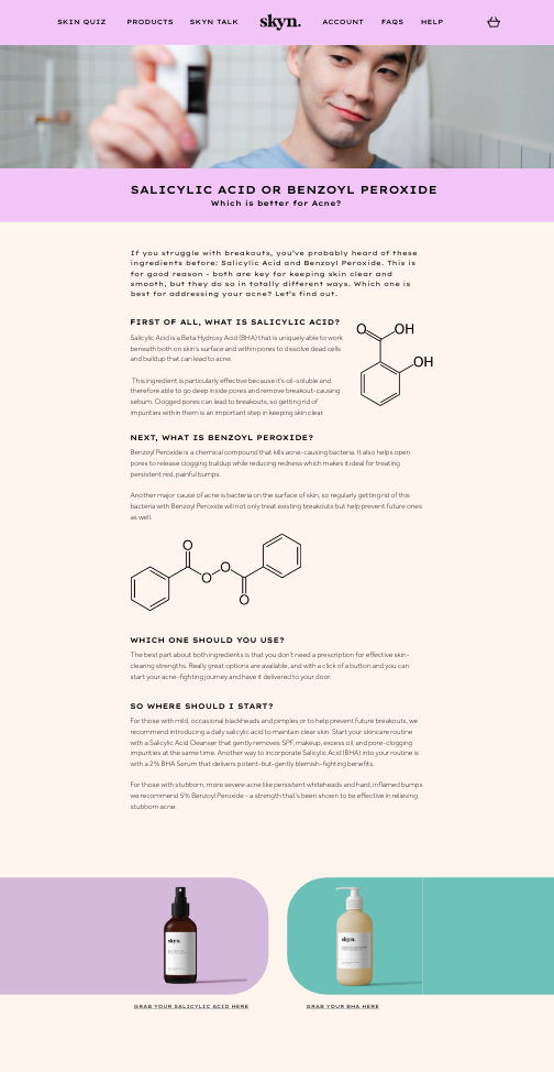
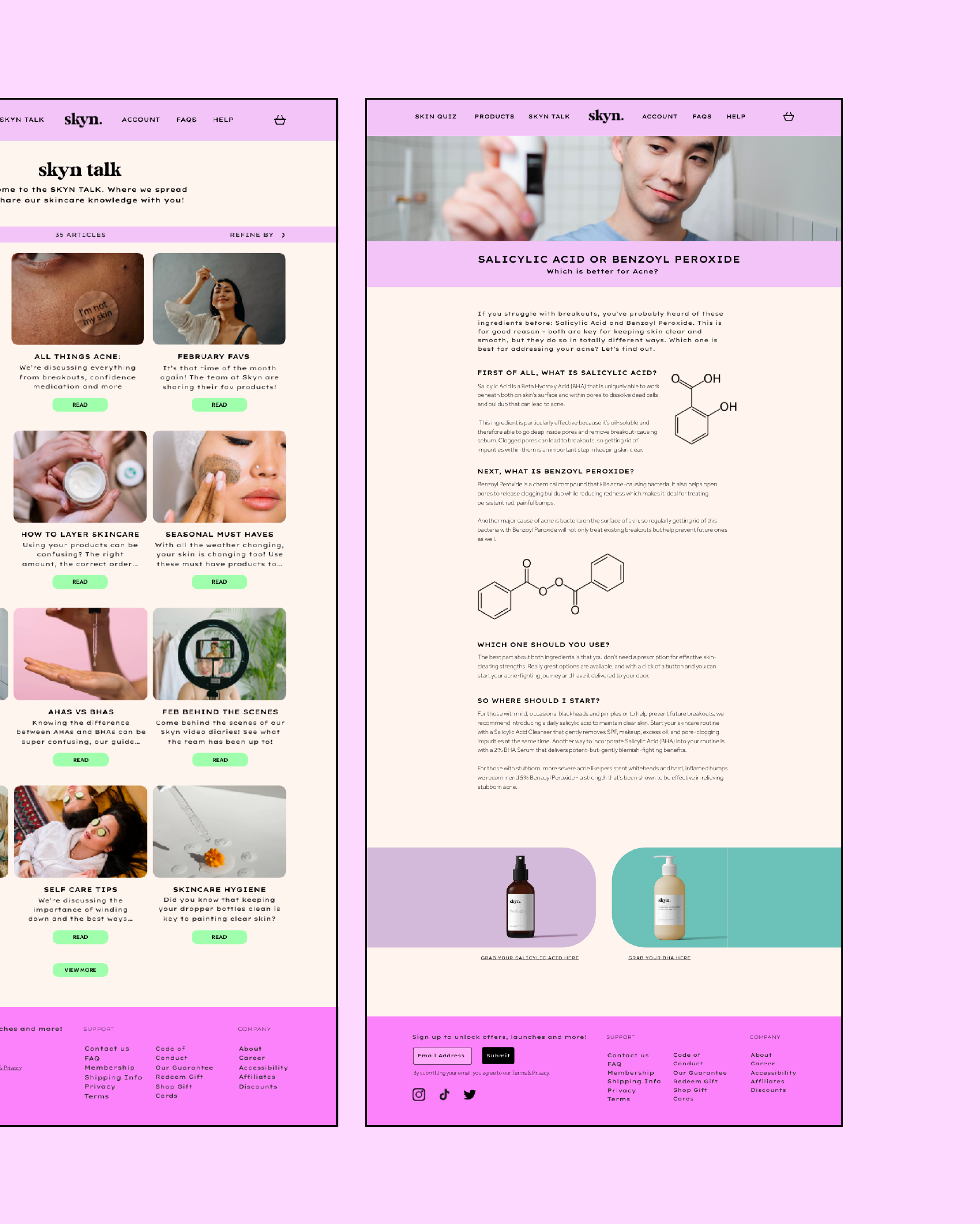
Blog Greeting Page (Web) Blog Article (Web)


Blog Greeting Page (Mobile) Blog Menu (Blog Article (Mobile) Blog Article (Mobile)
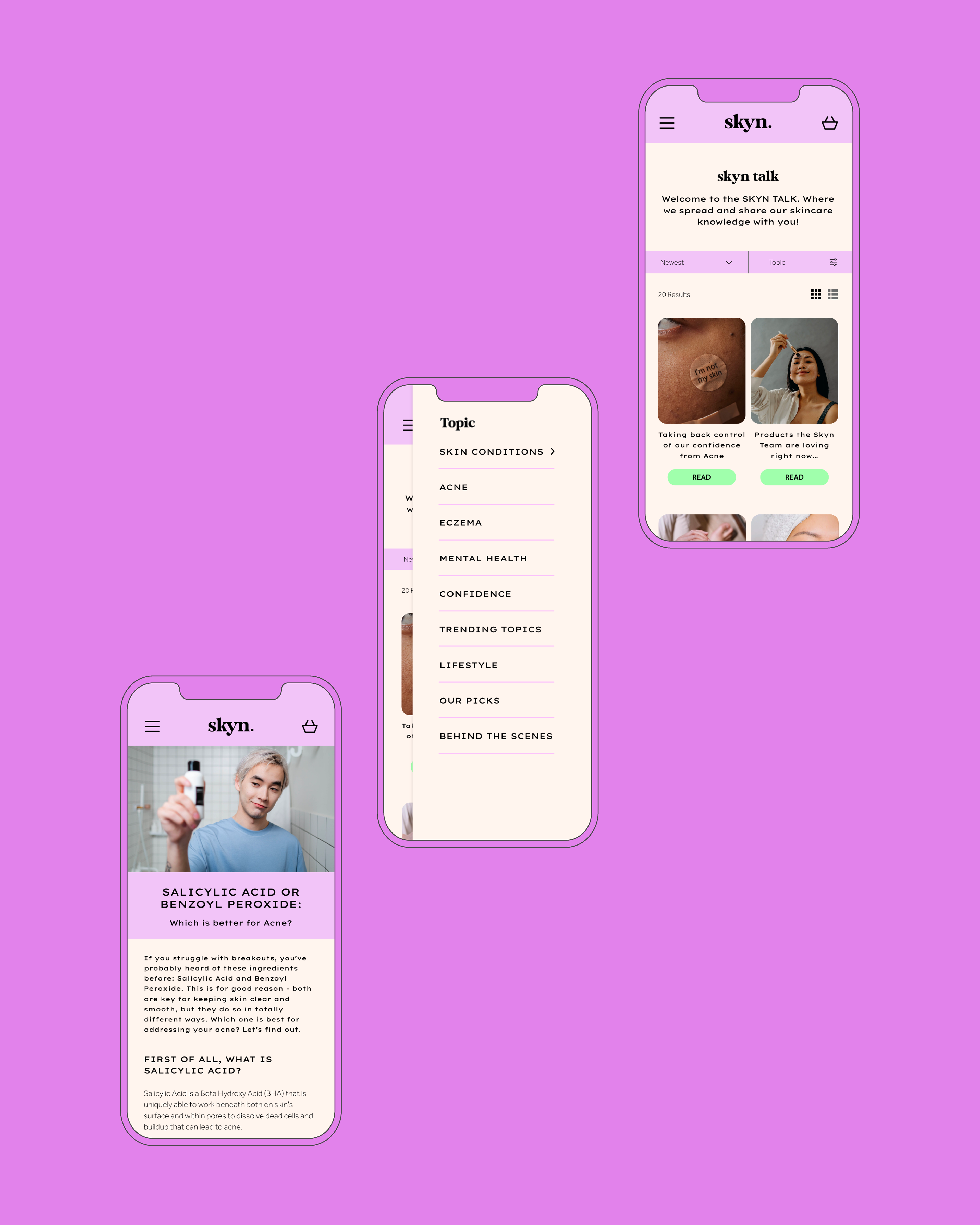
Skyn Talk aims to provides both customer and general visitors on the site with up to date skin care advice. With the ambition of tackling mental health and self-confidence, the blog offers a wide array of topics for users to filter through to find what they relate to or are interested in the most.
The web display provides an example of how the space allows for the article itself to be more flexible within its grid. The illustrative images have been placed across the rows and can be seen in unison with the descriptive text. Whereas, for the mobile display, the illustration has been placed below the paragraph in order to not compromise the legibility or space. Users are still able to link the image with the correct paragraph through the spacial treatment and typographical differentiation between the headings and body text of each section.
Mobile XD Prototype: https://xd.adobe.com/view/5dbe58b2-1c58-4e82-a96b-06e0696d9f46-08ed/
